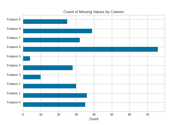
MissingValues Bar
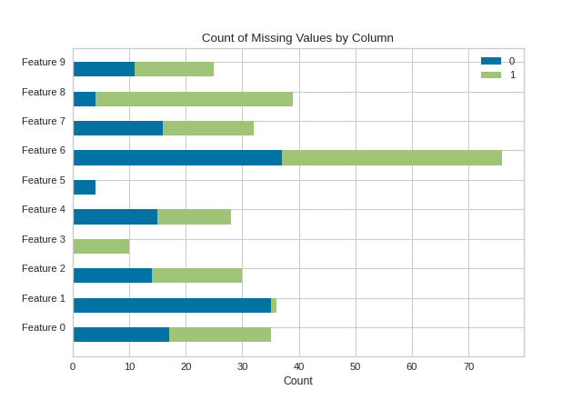
The MissingValues Bar visualizer creates a bar graph that counts the number of missing values per feature column. If the target y is supplied to fit, a stacked bar chart is produced.
Without Targets Supplied
import numpy as np

from sklearn.datasets import make_classification
from yellowbrick.contrib.missing import MissingValuesBar

# Make a classification dataset
X, y = make_classification(
    n_samples=400, n_features=10, n_informative=2, n_redundant=3,
    n_classes=2, n_clusters_per_class=2, random_state=854
)

# Assign NaN values
X[X > 1.5] = np.nan
features = ["Feature {}".format(str(n)) for n in range(10)]

# Instantiate the visualizer
visualizer = MissingValuesBar(features=features)

visualizer.fit(X)        # Fit the data to the visualizer
visualizer.show()        # Finalize and render the figure
(Source code, png, pdf)

With Targets (y) Supplied
import numpy as np

from sklearn.datasets import make_classification
from yellowbrick.contrib.missing import MissingValuesBar

# Make a classification dataset
X, y = make_classification(
    n_samples=400, n_features=10, n_informative=2, n_redundant=3,
    n_classes=2, n_clusters_per_class=2, random_state=854
)

# Assign NaN values
X[X > 1.5] = np.nan
features = ["Feature {}".format(str(n)) for n in range(10)]

# Instantiate the visualizer
visualizer = MissingValuesBar(features=features)

visualizer.fit(X, y=y)        # Supply the targets via y
visualizer.show()             # Finalize and render the figure
(Source code, png, pdf)
API Reference
Bar visualizer of missing values by column.
- class yellowbrick.contrib.missing.bar.MissingValuesBar(width=0.5, color=None, colors=None, classes=None, **kwargs)[source]
Bases:
MissingDataVisualizerThe MissingValues Bar visualizer creates a bar graph that lists the total count of missing values for each selected feature column.
When y targets are supplied to fit, the output is a stacked bar chart where each color corresponds to the total NaNs for the feature in that column.
- Parameters
- alphafloat, default: 0.5
A value for bending elments with the background.
- markermatplotlib marker, default: |
The marker used for each element coordinate in the plot
- colorstring, default: black
The color for drawing the bar chart when the y targets are not passed to fit.
- colorslist, default: None
The color palette for drawing a stack bar chart when the y targets are passed to fit.
- classeslist, default: None
A list of class names for the legend. If classes is None and a y value is passed to fit then the classes are selected from the target vector.
- kwargsdict
Keyword arguments that are passed to the base class and may influence the visualization as defined in other Visualizers.
Examples
>>> from yellowbrick.contrib.missing import MissingValuesBar
>>> visualizer = MissingValuesBar()
>>> visualizer.fit(X, y=y)
>>> visualizer.show()
- Attributes
- features_np.array
The feature labels ranked according to their importance
- classes_np.array
The class labels for each of the target values
- draw(X, y, **kwargs)[source]
Called from the fit method, this method generated a horizontal bar plot.
If y is none, then draws a simple horizontal bar chart. If y is not none, then draws a stacked horizontal bar chart for each nan count per target values.
- draw_stacked_bar(nan_col_counts)[source]
Draws a horizontal stacked bar chart with different colors for each count of nan values per label.