ROCAUC
A ROCAUC (Receiver Operating Characteristic/Area Under the Curve) plot allows the user to visualize the tradeoff between the classifier’s sensitivity and specificity.
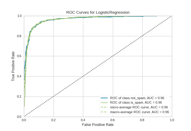
The Receiver Operating Characteristic (ROC) is a measure of a classifier’s predictive quality that compares and visualizes the tradeoff between the model’s sensitivity and specificity. When plotted, a ROC curve displays the true positive rate on the Y axis and the false positive rate on the X axis on both a global average and per-class basis. The ideal point is therefore the top-left corner of the plot: false positives are zero and true positives are one.
This leads to another metric, area under the curve (AUC), which is a computation of the relationship between false positives and true positives. The higher the AUC, the better the model generally is. However, it is also important to inspect the “steepness” of the curve, as this describes the maximization of the true positive rate while minimizing the false positive rate.
Visualizer |
|
Quick Method |
|
Models |
Classification |
Workflow |
Model evaluation |
from sklearn.linear_model import LogisticRegression
from sklearn.model_selection import train_test_split

from yellowbrick.classifier import ROCAUC
from yellowbrick.datasets import load_spam

# Load the classification dataset
X, y = load_spam()

# Create the training and test data
X_train, X_test, y_train, y_test = train_test_split(X, y, random_state=42)

# Instantiate the visualizer with the classification model
model = LogisticRegression(multi_class="auto", solver="liblinear")
visualizer = ROCAUC(model, classes=["not_spam", "is_spam"])

visualizer.fit(X_train, y_train)        # Fit the training data to the visualizer
visualizer.score(X_test, y_test)        # Evaluate the model on the test data
visualizer.show()                       # Finalize and show the figure
(Source code, png, pdf)
Warning
Versions of Yellowbrick =< v0.8 had a bug
that triggered an IndexError when attempting binary classification using
a Scikit-learn-style estimator with only a decision_function. This has been
fixed as of v0.9, where the micro, macro, and per-class parameters of
ROCAUC are set to False for such classifiers.
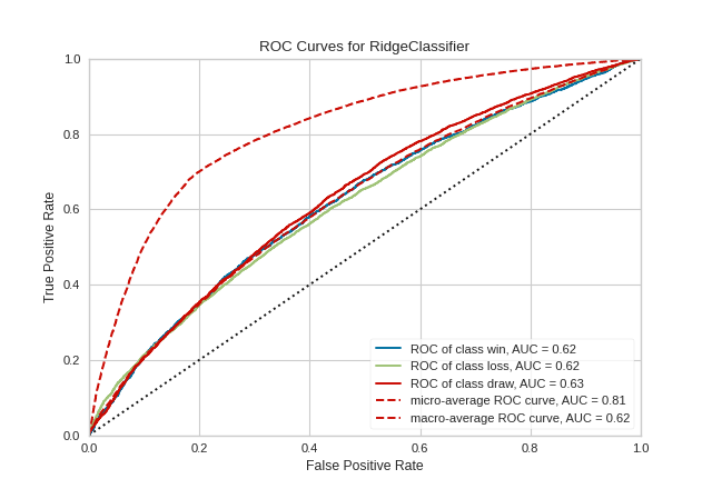
Multi-class ROCAUC Curves
Yellowbrick’s ROCAUC Visualizer does allow for plotting multiclass classification curves. ROC curves are typically used in binary classification, and in fact the Scikit-Learn roc_curve metric is only able to perform metrics for binary classifiers. Yellowbrick addresses this by binarizing the output (per-class) or to use one-vs-rest (micro score) or one-vs-all (macro score) strategies of classification.
from sklearn.linear_model import RidgeClassifier
from sklearn.model_selection import train_test_split
from sklearn.preprocessing import OrdinalEncoder, LabelEncoder

from yellowbrick.classifier import ROCAUC
from yellowbrick.datasets import load_game

# Load multi-class classification dataset
X, y = load_game()

# Encode the non-numeric columns
X = OrdinalEncoder().fit_transform(X)
y = LabelEncoder().fit_transform(y)

# Create the train and test data
X_train, X_test, y_train, y_test = train_test_split(X, y, random_state=42)

# Instaniate the classification model and visualizer
model = RidgeClassifier()
visualizer = ROCAUC(model, classes=["win", "loss", "draw"])

visualizer.fit(X_train, y_train)        # Fit the training data to the visualizer
visualizer.score(X_test, y_test)        # Evaluate the model on the test data
visualizer.show()                       # Finalize and render the figure
(Source code, png, pdf)

Warning
The target y must be numeric for this figure to work, or update to the latest version of sklearn.
By default with multi-class ROCAUC visualizations, a curve for each class is plotted, in addition to the micro- and macro-average curves for each class. This enables the user to inspect the tradeoff between sensitivity and specificity on a per-class basis. Note that for multi-class ROCAUC, at least one of the micro, macro, or per_class parameters must be set to True (by default, all are set to True).
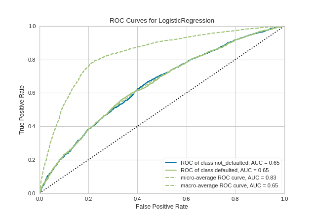
Quick Method
The same functionality above can be achieved with the associated quick method roc_auc. This method will build the ROCAUC object with the associated arguments, fit it, then (optionally) immediately show it
from yellowbrick.classifier.rocauc import roc_auc
from yellowbrick.datasets import load_credit
from sklearn.linear_model import LogisticRegression
from sklearn.model_selection import train_test_split

#Load the classification dataset
X, y = load_credit()

#Create the train and test data
X_train, X_test, y_train, y_test = train_test_split(X,y)

# Instantiate the visualizer with the classification model
model = LogisticRegression()
roc_auc(model, X_train, y_train, X_test=X_test, y_test=y_test, classes=['not_defaulted', 'defaulted'])
(Source code, png, pdf)
API Reference
Implements visual ROC/AUC curves for classification evaluation.
- class yellowbrick.classifier.rocauc.ROCAUC(estimator, ax=None, micro=True, macro=True, per_class=True, binary=False, classes=None, encoder=None, is_fitted='auto', force_model=False, **kwargs)[source]
Bases:
ClassificationScoreVisualizerReceiver Operating Characteristic (ROC) curves are a measure of a classifier’s predictive quality that compares and visualizes the tradeoff between the models’ sensitivity and specificity. The ROC curve displays the true positive rate on the Y axis and the false positive rate on the X axis on both a global average and per-class basis. The ideal point is therefore the top-left corner of the plot: false positives are zero and true positives are one.
This leads to another metric, area under the curve (AUC), a computation of the relationship between false positives and true positives. The higher the AUC, the better the model generally is. However, it is also important to inspect the “steepness” of the curve, as this describes the maximization of the true positive rate while minimizing the false positive rate. Generalizing “steepness” usually leads to discussions about convexity, which we do not get into here.
- Parameters
- estimatorestimator
A scikit-learn estimator that should be a classifier. If the model is not a classifier, an exception is raised. If the internal model is not fitted, it is fit when the visualizer is fitted, unless otherwise specified by
is_fitted.- axmatplotlib Axes, default: None
The axes to plot the figure on. If not specified the current axes will be used (or generated if required).
- microbool, default: True
Plot the micro-averages ROC curve, computed from the sum of all true positives and false positives across all classes. Micro is not defined for binary classification problems with estimators with only a decision_function method.
- macrobool, default: True
Plot the macro-averages ROC curve, which simply takes the average of curves across all classes. Macro is not defined for binary classification problems with estimators with only a decision_function method.
- per_classbool, default: True
Plot the ROC curves for each individual class. This should be set to false if only the macro or micro average curves are required. For true binary classifiers, setting per_class=False will plot the positive class ROC curve, and per_class=True will use
1-P(1)to compute the curve of the negative class if only a decision_function method exists on the estimator.- binarybool, default: False
This argument quickly resets the visualizer for true binary classification by updating the micro, macro, and per_class arguments to False (do not use in conjunction with those other arguments). Note that this is not a true hyperparameter to the visualizer, it just collects other parameters into a single, simpler argument.
- classeslist of str, defult: None
The class labels to use for the legend ordered by the index of the sorted classes discovered in the
fit()method. Specifying classes in this manner is used to change the class names to a more specific format or to label encoded integer classes. Some visualizers may also use this field to filter the visualization for specific classes. For more advanced usage specify an encoder rather than class labels.- encoderdict or LabelEncoder, default: None
A mapping of classes to human readable labels. Often there is a mismatch between desired class labels and those contained in the target variable passed to
fit()orscore(). The encoder disambiguates this mismatch ensuring that classes are labeled correctly in the visualization.- is_fittedbool or str, default=”auto”
Specify if the wrapped estimator is already fitted. If False, the estimator will be fit when the visualizer is fit, otherwise, the estimator will not be modified. If “auto” (default), a helper method will check if the estimator is fitted before fitting it again.
- force_modelbool, default: False
Do not check to ensure that the underlying estimator is a classifier. This will prevent an exception when the visualizer is initialized but may result in unexpected or unintended behavior.
- kwargsdict
Keyword arguments passed to the visualizer base classes.
Notes
ROC curves are typically used in binary classification, and in fact the Scikit-Learn
roc_curvemetric is only able to perform metrics for binary classifiers. As a result it is necessary to binarize the output or to use one-vs-rest or one-vs-all strategies of classification. The visualizer does its best to handle multiple situations, but exceptions can arise from unexpected models or outputs.Another important point is the relationship of class labels specified on initialization to those drawn on the curves. The classes are not used to constrain ordering or filter curves; the ROC computation happens on the unique values specified in the target vector to the
scoremethod. To ensure the best quality visualization, do not use a LabelEncoder for this and do not pass in class labels.Examples
>>> from yellowbrick.classifier import ROCAUC
>>> from sklearn.linear_model import LogisticRegression
>>> from sklearn.model_selection import train_test_split
>>> data = load_data("occupancy")
>>> features = ["temp", "relative humidity", "light", "C02", "humidity"]
>>> X_train, X_test, y_train, y_test = train_test_split(X, y)
>>> oz = ROCAUC(LogisticRegression())
>>> oz.fit(X_train, y_train)
>>> oz.score(X_test, y_test)
>>> oz.show()
- Attributes
- classes_ndarray of shape (n_classes,)
The class labels observed while fitting.
- class_count_ndarray of shape (n_classes,)
Number of samples encountered for each class during fitting.
- score_float
An evaluation metric of the classifier on test data produced when
score()is called. This metric is between 0 and 1 – higher scores are generally better. For classifiers, this score is usually accuracy, but if micro or macro is specified this returns an F1 score.- target_type_string
Specifies if the detected classification target was binary or multiclass.
- draw()[source]
Renders ROC-AUC plot. Called internally by score, possibly more than once
- Returns
- axthe axis with the plotted figure
- finalize(**kwargs)[source]
Sets a title and axis labels of the figures and ensures the axis limits are scaled between the valid ROCAUC score values.
- Parameters
- kwargs: generic keyword arguments.
Notes
Generally this method is called from show and not directly by the user.
- score(X, y=None)[source]
Generates the predicted target values using the Scikit-Learn estimator.
- Parameters
- Xndarray or DataFrame of shape n x m
A matrix of n instances with m features
- yndarray or Series of length n
An array or series of target or class values
- Returns
- score_float
Global accuracy unless micro or macro scores are requested.
- yellowbrick.classifier.rocauc.roc_auc(estimator, X_train, y_train, X_test=None, y_test=None, ax=None, micro=True, macro=True, per_class=True, binary=False, classes=None, encoder=None, is_fitted='auto', force_model=False, show=True, **kwargs)[source]
ROCAUC
Receiver Operating Characteristic (ROC) curves are a measure of a classifier’s predictive quality that compares and visualizes the tradeoff between the models’ sensitivity and specificity. The ROC curve displays the true positive rate on the Y axis and the false positive rate on the X axis on both a global average and per-class basis. The ideal point is therefore the top-left corner of the plot: false positives are zero and true positives are one.
This leads to another metric, area under the curve (AUC), a computation of the relationship between false positives and true positives. The higher the AUC, the better the model generally is. However, it is also important to inspect the “steepness” of the curve, as this describes the maximization of the true positive rate while minimizing the false positive rate. Generalizing “steepness” usually leads to discussions about convexity, which we do not get into here.
- Parameters
- estimatorestimator
A scikit-learn estimator that should be a classifier. If the model is not a classifier, an exception is raised. If the internal model is not fitted, it is fit when the visualizer is fitted, unless otherwise specified by
is_fitted.- X_trainarray-like, 2D
The table of instance data or independent variables that describe the outcome of the dependent variable, y. Used to fit the visualizer and also to score the visualizer if test splits are not specified.
- y_trainarray-like, 2D
The vector of target data or the dependent variable predicted by X. Used to fit the visualizer and also to score the visualizer if test splits not specified.
- X_test: array-like, 2D, default: None
The table of instance data or independent variables that describe the outcome of the dependent variable, y. Used to score the visualizer if specified.
- y_test: array-like, 1D, default: None
The vector of target data or the dependent variable predicted by X. Used to score the visualizer if specified.
- axmatplotlib Axes, default: None
The axes to plot the figure on. If not specified the current axes will be used (or generated if required).
- test_sizefloat, default=0.2
The percentage of the data to reserve as test data.
- random_stateint or None, default=None
The value to seed the random number generator for shuffling data.
- microbool, default: True
Plot the micro-averages ROC curve, computed from the sum of all true positives and false positives across all classes. Micro is not defined for binary classification problems with estimators with only a decision_function method.
- macrobool, default: True
Plot the macro-averages ROC curve, which simply takes the average of curves across all classes. Macro is not defined for binary classification problems with estimators with only a decision_function method.
- per_classbool, default: True
Plot the ROC curves for each individual class. This should be set to false if only the macro or micro average curves are required. For true binary classifiers, setting per_class=False will plot the positive class ROC curve, and per_class=True will use
1-P(1)to compute the curve of the negative class if only a decision_function method exists on the estimator.- binarybool, default: False
This argument quickly resets the visualizer for true binary classification by updating the micro, macro, and per_class arguments to False (do not use in conjunction with those other arguments). Note that this is not a true hyperparameter to the visualizer, it just collects other parameters into a single, simpler argument.
- classeslist of str, defult: None
The class labels to use for the legend ordered by the index of the sorted classes discovered in the
fit()method. Specifying classes in this manner is used to change the class names to a more specific format or to label encoded integer classes. Some visualizers may also use this field to filter the visualization for specific classes. For more advanced usage specify an encoder rather than class labels.- encoderdict or LabelEncoder, default: None
A mapping of classes to human readable labels. Often there is a mismatch between desired class labels and those contained in the target variable passed to
fit()orscore(). The encoder disambiguates this mismatch ensuring that classes are labeled correctly in the visualization.- is_fittedbool or str, default=”auto”
Specify if the wrapped estimator is already fitted. If False, the estimator will be fit when the visualizer is fit, otherwise, the estimator will not be modified. If “auto” (default), a helper method will check if the estimator is fitted before fitting it again.
- force_modelbool, default: False
Do not check to ensure that the underlying estimator is a classifier. This will prevent an exception when the visualizer is initialized but may result in unexpected or unintended behavior.
- show: bool, default: True
If True, calls
show(), which in turn callsplt.show()however you cannot callplt.savefigfrom this signature, norclear_figure. If False, simply callsfinalize()- kwargsdict
Keyword arguments passed to the visualizer base classes.
- Returns
- vizROCAUC
Returns the fitted, finalized visualizer object
Notes
ROC curves are typically used in binary classification, and in fact the Scikit-Learn
roc_curvemetric is only able to perform metrics for binary classifiers. As a result it is necessary to binarize the output or to use one-vs-rest or one-vs-all strategies of classification. The visualizer does its best to handle multiple situations, but exceptions can arise from unexpected models or outputs.Another important point is the relationship of class labels specified on initialization to those drawn on the curves. The classes are not used to constrain ordering or filter curves; the ROC computation happens on the unique values specified in the target vector to the
scoremethod. To ensure the best quality visualization, do not use a LabelEncoder for this and do not pass in class labels.See also
Examples
>>> from yellowbrick.classifier import ROCAUC
>>> from sklearn.linear_model import LogisticRegression
>>> data = load_data("occupancy")
>>> features = ["temp", "relative humidity", "light", "C02", "humidity"]
>>> X = data[features].values
>>> y = data.occupancy.values
>>> roc_auc(LogisticRegression(), X, y)