Feature Correlation
This visualizer calculates Pearson correlation coefficients and mutual information between features and the dependent variable. This visualization can be used in feature selection to identify features with high correlation or large mutual information with the dependent variable.
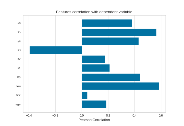
Pearson Correlation
The default calculation is Pearson correlation, which is performed with scipy.stats.pearsonr.
Visualizer |
|
Quick Method |
|
Models |
Regression/Classification/Clustering |
Workflow |
Feature Engineering/Model Selection |
from sklearn import datasets
from yellowbrick.target import FeatureCorrelation

# Load the regression dataset
data = datasets.load_diabetes()
X, y = data['data'], data['target']

# Create a list of the feature names
features = np.array(data['feature_names'])

# Instantiate the visualizer
visualizer = FeatureCorrelation(labels=features)

visualizer.fit(X, y)        # Fit the data to the visualizer
visualizer.show()           # Finalize and render the figure
(Source code, png, pdf)

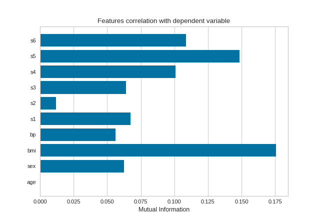
Mutual Information - Regression
Mutual information between features and the dependent variable is calculated with sklearn.feature_selection.mutual_info_classif when method='mutual_info-classification' and mutual_info_regression when method='mutual_info-regression'.
It is very important to specify discrete features when calculating mutual information because the calculation for continuous and discrete variables are different.
See scikit-learn documentation for more details.
from sklearn import datasets
from yellowbrick.target import FeatureCorrelation

# Load the regression dataset
data = datasets.load_diabetes()
X, y = data['data'], data['target']

# Create a list of the feature names
features = np.array(data['feature_names'])

# Create a list of the discrete features
discrete = [False for _ in range(len(features))]
discrete[1] = True

# Instantiate the visualizer
visualizer = FeatureCorrelation(method='mutual_info-regression', labels=features)

visualizer.fit(X, y, discrete_features=discrete, random_state=0)
visualizer.show()
(Source code, png, pdf)
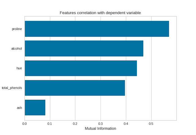
Mutual Information - Classification
By fitting with a pandas DataFrame, the feature labels are automatically obtained from the column names. This visualizer also allows sorting of the bar plot according to the calculated mutual information (or Pearson correlation coefficients) and selecting features to plot by specifying the names of the features or the feature index.
import pandas as pd

from sklearn import datasets
from yellowbrick.target import FeatureCorrelation

# Load the regression dataset
data = datasets.load_wine()
X, y = data['data'], data['target']
X_pd = pd.DataFrame(X, columns=data['feature_names'])

# Create a list of the features to plot
features = ['alcohol', 'ash', 'hue', 'proline', 'total_phenols']

# Instaniate the visualizer
visualizer = FeatureCorrelation(
    method='mutual_info-classification', feature_names=features, sort=True
)

visualizer.fit(X_pd, y)        # Fit the data to the visualizer
visualizer.show()              # Finalize and render the figure
(Source code, png, pdf)
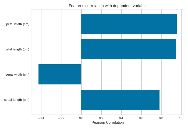
Quick Method
The same functionality above can be achieved with the associated quick method feature_correlation. This method will build the FeatureCorrelation object with the associated arguments, fit it, then (optionally) immediately show it
import numpy as np
from sklearn import datasets
import matplotlib.pyplot as plt
from yellowbrick.target.feature_correlation import feature_correlation

#Load the diabetes dataset
data = datasets.load_iris()
X, y = data['data'], data['target']

features = np.array(data['feature_names'])
visualizer = feature_correlation(X, y, labels=features)
plt.tight_layout()
(Source code, png, pdf)

API Reference
Feature Correlation to Dependent Variable Visualizer.
- class yellowbrick.target.feature_correlation.FeatureCorrelation(ax=None, method='pearson', labels=None, sort=False, feature_index=None, feature_names=None, color=None, **kwargs)[source]
Bases:
TargetVisualizerDisplays the correlation between features and dependent variables.
This visualizer can be used side-by-side with
yellowbrick.features.JointPlotVisualizerthat plots a feature against the target and shows the distribution of each via a histogram on each axis.- Parameters
- axmatplotlib Axes, default: None
The axis to plot the figure on. If None is passed in the current axes will be used (or generated if required).
- methodstr, default: ‘pearson’
The method to calculate correlation between features and target. Options include:
‘pearson’, which uses
scipy.stats.pearsonr‘mutual_info-regression’, which uses
mutual_info-regressionfromsklearn.feature_selection‘mutual_info-classification’, which uses
mutual_info_classiffromsklearn.feature_selection
- labelslist, default: None
A list of feature names to use. If a DataFrame is passed to fit and features is None, feature names are selected as the column names.
- sortboolean, default: False
If false, the features are are not sorted in the plot; otherwise features are sorted in ascending order of correlation.
- feature_indexlist,
A list of feature index to include in the plot.
- feature_nameslist of feature names
A list of feature names to include in the plot. Must have labels or the fitted data is a DataFrame with column names. If feature_index is provided, feature_names will be ignored.
- color: string
Specify color for barchart
- kwargsdict
Keyword arguments that are passed to the base class and may influence the visualization as defined in other Visualizers.
Examples
>>> viz = FeatureCorrelation()
>>> viz.fit(X, y)
>>> viz.show()
- Attributes
- features_np.array
The feature labels
- scores_np.array
Correlation between features and dependent variable.
- fit(X, y, **kwargs)[source]
Fits the estimator to calculate feature correlation to dependent variable.
- Parameters
- Xndarray or DataFrame of shape n x m
A matrix of n instances with m features
- yndarray or Series of length n
An array or series of target or class values
- kwargsdict
Keyword arguments passed to the fit method of the estimator.
- Returns
- selfvisualizer
The fit method must always return self to support pipelines.
- yellowbrick.target.feature_correlation.feature_correlation(X, y, ax=None, method='pearson', labels=None, sort=False, feature_index=None, feature_names=None, color=None, show=True, **kwargs)[source]
Displays the correlation between features and dependent variables.
This visualizer can be used side-by-side with yellowbrick.features.JointPlotVisualizer that plots a feature against the target and shows the distribution of each via a histogram on each axis.
- Parameters
- Xndarray or DataFrame of shape n x m
A matrix of n instances with m features
- yndarray or Series of length n
An array or series of target or class values
- axmatplotlib Axes, default: None
The axis to plot the figure on. If None is passed in the current axes will be used (or generated if required).
- methodstr, default: ‘pearson’
The method to calculate correlation between features and target. Options include:
‘pearson’, which uses
scipy.stats.pearsonr‘mutual_info-regression’, which uses
mutual_info-regressionfromsklearn.feature_selection‘mutual_info-classification’, which uses
mutual_info_classiffromsklearn.feature_selection
- labelslist, default: None
A list of feature names to use. If a DataFrame is passed to fit and features is None, feature names are selected as the column names.
- sortboolean, default: False
If false, the features are are not sorted in the plot; otherwise features are sorted in ascending order of correlation.
- feature_indexlist,
A list of feature index to include in the plot.
- feature_nameslist of feature names
A list of feature names to include in the plot. Must have labels or the fitted data is a DataFrame with column names. If feature_index is provided, feature_names will be ignored.
- color: string
Specify color for barchart
- show: bool, default: True
If True, calls
show(), which in turn callsplt.show()however you cannot callplt.savefigfrom this signature, norclear_figure. If False, simply callsfinalize()- kwargsdict
Keyword arguments that are passed to the base class and may influence the visualization as defined in other Visualizers.
- Returns
- visualizerFeatureCorrelation
Returns the fitted visualizer.