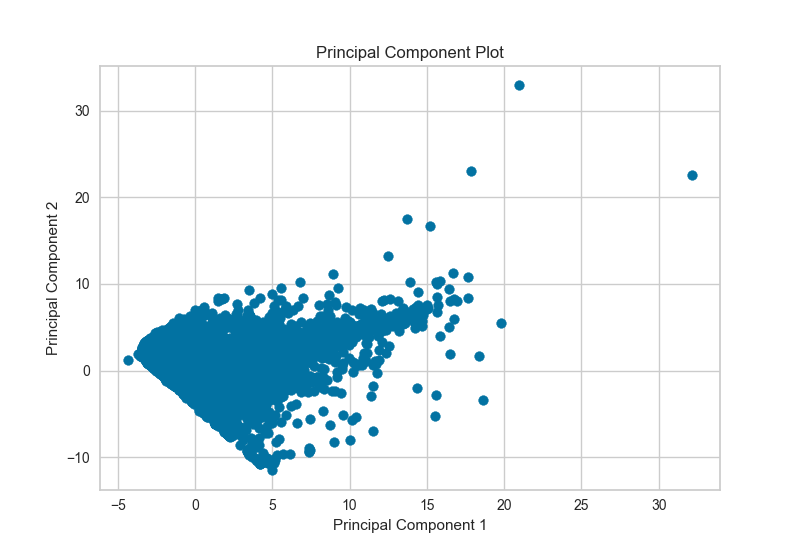
PCA Projection
The PCA Decomposition visualizer utilizes principle component analysis to decompose high dimensional data into two or three dimensions so that each instance can be plotted in a scatter plot. The use of PCA means that the projected dataset can be analyzed along axes of principle variation and can be interpreted to determine if spherical distance metrics can be utilized.
# Load the classification data set
data = load_data('credit')

# Specify the features of interest
features = [
    'limit', 'sex', 'edu', 'married', 'age', 'apr_delay', 'may_delay',
    'jun_delay', 'jul_delay', 'aug_delay', 'sep_delay', 'apr_bill', 'may_bill',
    'jun_bill', 'jul_bill', 'aug_bill', 'sep_bill', 'apr_pay', 'may_pay', 'jun_pay',
    'jul_pay', 'aug_pay', 'sep_pay',
]

# Extract the numpy arrays from the data frame
X = data[features].as_matrix()
y = data.default.as_matrix()
visualizer = PCADecomposition(scale=True, center=False, col=y)
visualizer.fit_transform(X,y)
visualizer.poof()
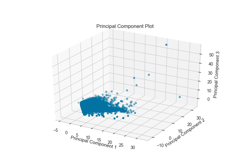
The PCA projection can also be plotted in three dimensions to attempt to visualize more princple components and get a better sense of the distribution in high dimensions.
visualizer = PCADecomposition(scale=True, center=False, col=y, proj_dim=3)
visualizer.fit_transform(X,y)
visualizer.poof()
API Reference
Decomposition based feature visualization with PCA.
-
class
yellowbrick.features.pca.PCADecomposition(ax=None, scale=True, color=None, proj_dim=2, colormap='RdBu', **kwargs)[kaynak]¶ Bases:
yellowbrick.features.base.FeatureVisualizerProduce a two or three dimensional principal component plot of the data array
Xprojected onto it’s largest sequential principal components. It is common practice to scale the data arrayXbefore applying a PC decomposition. Variable scaling can be controlled using thescaleargument.Parameters: - X : ndarray or DataFrame of shape n x m
A matrix of n instances with m features.
- y : ndarray or Series of length n
An array or series of target or class values.
- ax : matplotlib Axes, default: None
The axes to plot the figure on. If None is passed in the current axes. will be used (or generated if required).
- scale : bool, default: True
Boolean that indicates if user wants to scale data.
- proj_dim : int, default: 2
Dimension of the PCA visualizer.
- color : list or tuple of colors, default: None
Specify the colors for each individual class.
- colormap : string or cmap, default: None
Optional string or matplotlib cmap to colorize lines. Use either color to colorize the lines on a per class basis or colormap to color them on a continuous scale.
- kwargs : dict
Keyword arguments that are passed to the base class and may influence the visualization as defined in other Visualizers.
Examples
>>> from sklearn import datasets
>>> iris = datasets.load_iris()
>>> X = iris.data
>>> y = iris.target
>>> params = {'scale': True, 'center': False, 'col': y}
>>> visualizer = PCADecomposition(**params)
>>> visualizer.fit(X)
>>> visualizer.transform(X)
>>> visualizer.poof()
-
draw(**kwargs)[kaynak]¶ The fitting or transformation process usually calls draw (not the user). This function is implemented for developers to hook into the matplotlib interface and to create an internal representation of the data the visualizer was trained on in the form of a figure or axes.
Parameters: - kwargs: dict
generic keyword arguments.
-
finalize(**kwargs)[kaynak]¶ Finalize executes any subclass-specific axes finalization steps.
Parameters: - kwargs: dict
generic keyword arguments.
Notes
The user calls poof and poof calls finalize. Developers should implement visualizer-specific finalization methods like setting titles or axes labels, etc.
-
fit(X, y=None, **kwargs)[kaynak]¶ Fits a visualizer to data and is the primary entry point for producing a visualization. Visualizers are Scikit-Learn Estimator objects, which learn from data in order to produce a visual analysis or diagnostic. They can do this either by fitting features related data or by fitting an underlying model (or models) and visualizing their results.
Parameters: - X : ndarray or DataFrame of shape n x m
A matrix of n instances with m features
- y : ndarray or Series of length n
An array or series of target or class values
- kwargs: dict
Keyword arguments passed to the drawing functionality or to the Scikit-Learn API. See visualizer specific details for how to use the kwargs to modify the visualization or fitting process.
Returns: - self : visualizer
The fit method must always return self to support pipelines.