Direct Data Visualization
Sometimes for feature analysis you simply need a scatter plot to determine the distribution of data. Machine learning operates on high dimensional data, so the number of dimensions has to be filtered. As a result these visualizations are typically used as the base for larger visualizers; however you can also use them to quickly plot data during ML analysis.
Scatter Visualization
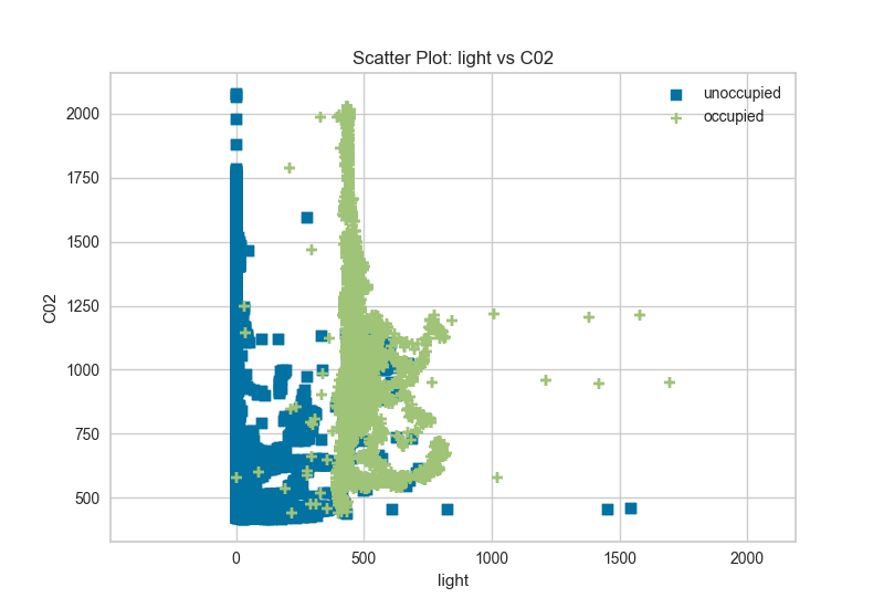
A scatter visualizer simply plots two features against each other and colors the points according to the target. This can be useful in assessing the relationship of pairs of features to an individual target.
# Load the classification data set
data = load_data('occupancy')

# Specify the features of interest and the classes of the target
features = ["temperature", "relative humidity", "light", "C02", "humidity"]
classes = ['unoccupied', 'occupied']

# Extract the numpy arrays from the data frame
X = data[features]
y = data.occupancy
from yellowbrick.features import ScatterVisualizer

visualizer = ScatterVisualizer(x='light', y='C02', classes=classes)

visualizer.fit(X, y)
visualizer.transform(X)
visualizer.poof()
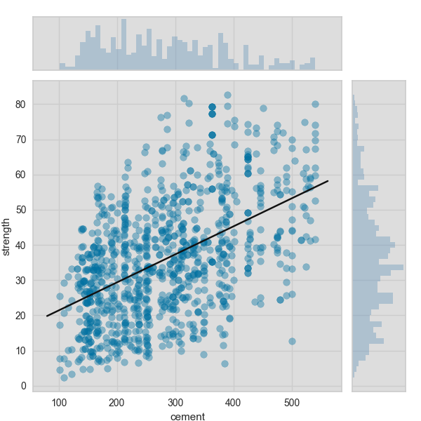
Joint Plot Visualization
A joint plot visualizer plots a feature against the target and shows the distribution of each via a histogram on each axis.
# Load the data
df = load_data('concrete')
feature = 'cement'
target = 'strength'

# Get the X and y data from the DataFrame
X = df[feature]
y = df[target]
visualizer = JointPlotVisualizer(feature=feature, target=target)

visualizer.fit(X, y)
visualizer.poof()
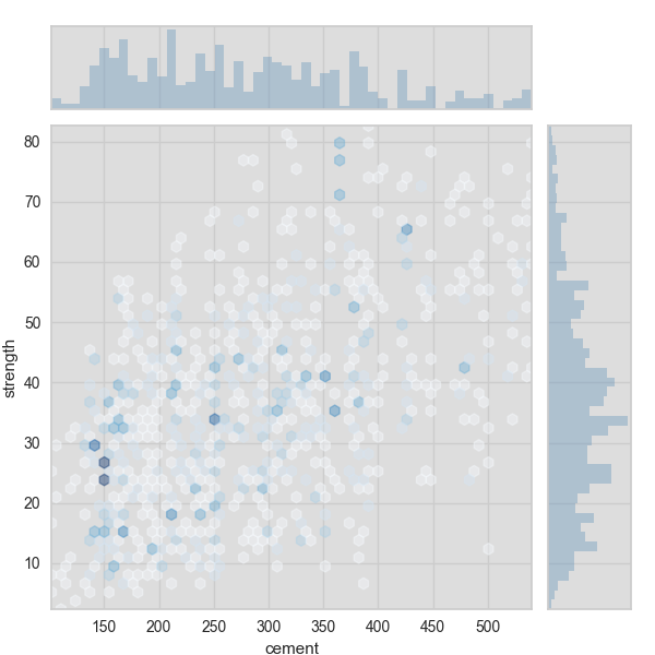
The joint plot visualizer can also be plotted with hexbins in the case of many, many points.
visualizer = JointPlotVisualizer(
    feature=feature, target=target, joint_plot='hex'
)

visualizer.fit(X, y)
visualizer.poof()
API Reference
Implements a 2D scatter plot for feature analysis.
-
class
yellowbrick.features.scatter.ScatterVisualizer(ax=None, x=None, y=None, features=None, classes=None, color=None, colormap=None, markers=None, **kwargs)[kaynak]¶ Bases:
yellowbrick.features.base.DataVisualizerScatterVisualizer is a bivariate feature data visualization algorithm that plots using the Cartesian coordinates of each point.
Parameters: - ax : a matplotlib plot, default: None
The axis to plot the figure on.
- x : string, default: None
The feature name that corresponds to a column name or index postion in the matrix that will be plotted against the x-axis
- y : string, default: None
The feature name that corresponds to a column name or index postion in the matrix that will be plotted against the y-axis
- features : a list of two feature names to use, default: None
List of two features that correspond to the columns in the array. The order of the two features correspond to X and Y axes on the graph. More than two feature names or columns will raise an error. If a DataFrame is passed to fit and features is None, feature names are selected that are the columns of the DataFrame.
- classes : a list of class names for the legend, default: None
If classes is None and a y value is passed to fit then the classes are selected from the target vector.
- color : optional list or tuple of colors to colorize points, default: None
Use either color to colorize the points on a per class basis or colormap to color them on a continuous scale.
- colormap : optional string or matplotlib cmap to colorize points, default: None
Use either color to colorize the points on a per class basis or colormap to color them on a continuous scale.
- markers : iterable of strings, default: ,+o*vhd
Matplotlib style markers for points on the scatter plot points
kwargs : keyword arguments passed to the super class.
These parameters can be influenced later on in the visualization process, but can and should be set as early as possible.
-
draw(X, y, **kwargs)[kaynak]¶ Called from the fit method, this method creates a scatter plot that draws each instance as a class or target colored point, whose location is determined by the feature data set.
-
finalize(**kwargs)[kaynak]¶ Finalize executes any subclass-specific axes finalization steps. The user calls poof and poof calls finalize.
Parameters: - kwargs: generic keyword arguments.
-
fit(X, y=None, **kwargs)[kaynak]¶ The fit method is the primary drawing input for the parallel coords visualization since it has both the X and y data required for the viz and the transform method does not.
Parameters: - X : ndarray or DataFrame of shape n x m
A matrix of n instances with 2 features
- y : ndarray or Series of length n
An array or series of target or class values
- kwargs : dict
Pass generic arguments to the drawing method
Returns: - self : instance
Returns the instance of the transformer/visualizer
-
class
yellowbrick.features.jointplot.JointPlotVisualizer(ax=None, feature=None, target=None, joint_plot='scatter', joint_args=None, xy_plot='hist', xy_args=None, size=600, ratio=5, space=0.2, **kwargs)[kaynak]¶ Bases:
yellowbrick.features.base.FeatureVisualizerJointPlotVisualizer allows for a simultaneous visualization of the relationship between two variables and the distrbution of each individual variable. The relationship is plotted along the joint axis and univariate distributions are plotted on top of the x axis and to the right of the y axis.
Parameters: - ax: matplotlib Axes, default: None
This is inherited from FeatureVisualizer but is defined within JointPlotVisualizer since there are three axes objects.
- feature: string, default: None
The name of the X variable If a DataFrame is passed to fit and feature is None, feature is selected as the column of the DataFrame. There must be only one column in the DataFrame.
- target: string, default: None
The name of the Y variable If target is None and a y value is passed to fit then the target is selected from the target vector.
- joint_plot: one of {‘scatter’, ‘hex’}, default: ‘scatter’
The type of plot to render in the joint axis Currently, the choices are scatter and hex. Use scatter for small datasets and hex for large datasets
- joint_args: dict, default: None
Keyword arguments used for customizing the joint plot:
Property Description alpha transparency facecolor background color of the joint axis aspect aspect ratio fit used if scatter is selected for joint_plot to draw a best fit line - values can be True or False. Uses Yellowbrick.bestfitestimator used if scatter is selected for joint_plot to determine the type of best fit line to use. Refer to Yellowbrick.bestfit for types of estimators that can be used. x_bins used if hex is selected to set the number of bins for the x value y_bins used if hex is selected to set the number of bins for the y value cmap string or matplotlib cmap to colorize lines Use either color to colorize the lines on a per class basis or colormap to color them on a continuous scale. - xy_plot: one of {‘hist’}, default: ‘hist’
The type of plot to render along the x and y axes Currently, the choice is hist
- xy_args: dict, default: None
Keyword arguments used for customizing the x and y plots:
Property Description alpha transparency facecolor_x background color of the x axis facecolor_y background color of the y axis bins used to set up the number of bins for the hist plot histcolor_x used to set the color for the histogram on the x axis histcolor_y used to set the color for the histogram on the y axis - size: float, default: 600
Size of each side of the figure in pixels
- ratio: float, default: 5
Ratio of joint axis size to the x and y axes height
- space: float, default: 0.2
Space between the joint axis and the x and y axes
- kwargs : dict
Keyword arguments that are passed to the base class and may influence the visualization as defined in other Visualizers.
Notes
These parameters can be influenced later on in the visualization process, but can and should be set as early as possible.
Examples
>>> visualizer = JointPlotVisualizer()
>>> visualizer.fit(X,y)
>>> visualizer.poof()
-
draw(X, y, **kwargs)[kaynak]¶ Sets up the layout for the joint plot draw calls
draw_jointanddraw_xyto render the visualizations.
-
finalize(**kwargs)[kaynak]¶ Finalize executes any subclass-specific axes finalization steps. The user calls poof and poof calls finalize.
Parameters: - kwargs: generic keyword arguments.
-
fit(X, y, **kwargs)[kaynak]¶ Sets up the X and y variables for the jointplot and checks to ensure that X and y are of the correct data type
Fit calls draw
Parameters: - X : ndarray or DataFrame of shape n x 1
A matrix of n instances with 1 feature
- y : ndarray or Series of length n
An array or series of the target value
- kwargs: dict
keyword arguments passed to Scikit-Learn API.