UMAP Corpus Visualization
Uniform Manifold Approximation and Projection (UMAP) is a nonlinear
dimensionality reduction method that is well suited to embedding in two
or three dimensions for visualization as a scatter plot. UMAP is a
relatively new technique but is very effective for visualizing clusters or
groups of data points and their relative proximities. It does a good job
of learning the local structure within your data but also attempts to
preserve the relationships between your groups as can be seen in its
exploration of
MNIST.
It is fast, scalable, and can be applied directly to sparse matrices,
eliminating the need to run TruncatedSVD as a pre-processing step.
Additionally, it supports a wide variety of distance measures allowing
for easy exploration of your data. For a more detailed explanation of the algorithm
the paper can be found here.
Visualizer |
|
Quick Method |
|
Models |
Decomposition |
Workflow |
Feature Engineering/Selection |
In this example, we represent documents via a term frequency inverse document frequency (TF-IDF) vector and then use UMAP to find a low dimensional representation of these documents. Next, the Yellowbrick visualizer plots the scatter plot, coloring by cluster or by class, or neither if a structural analysis is required.
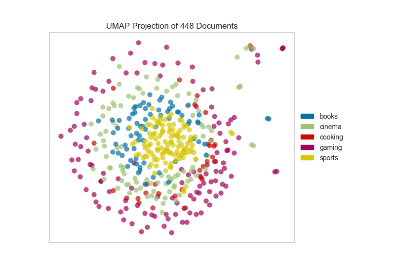
After importing the required tools, we can use the the hobbies corpus and vectorize the text using TF-IDF. Once the corpus is vectorized we can visualize it, showing the distribution of classes.
from sklearn.feature_extraction.text import TfidfVectorizer

from yellowbrick.datasets import load_hobbies
from yellowbrick.text import UMAPVisualizer

# Load the text data
corpus = load_hobbies()

tfidf = TfidfVectorizer()
docs = tfidf.fit_transform(corpus.data)
labels = corpus.target

# Instantiate the text visualizer
umap = UMAPVisualizer()
umap.fit(docs, labels)
umap.show()
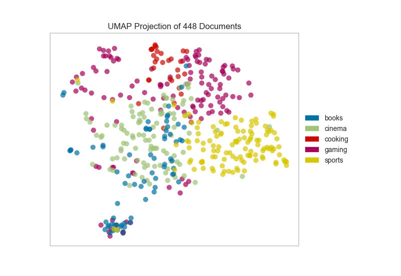
Alternatively, if we believed that cosine distance was a more
appropriate metric on our feature space we could specify that via a
metric parameter passed through to the underlying UMAP function by
the UMAPVisualizer.
umap = UMAPVisualizer(metric='cosine')
umap.fit(docs, labels)
umap.show()
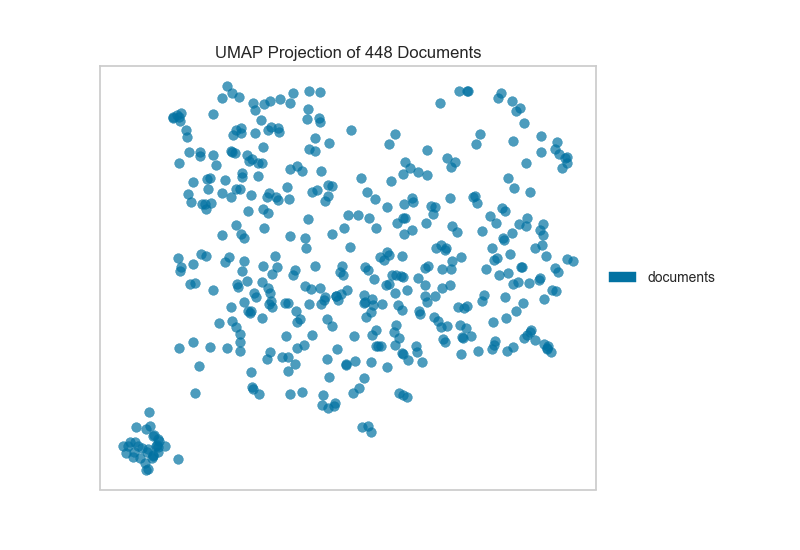
If we omit the target during fit, we can visualize the whole dataset to see if any meaningful patterns are observed.
# Don't color points with their classes
umap = UMAPVisualizer(labels=["documents"], metric='cosine')
umap.fit(docs)
umap.show()
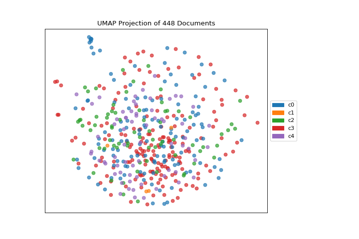
This means we don’t have to use class labels at all. Instead, we can use cluster membership from K-Means to label each document. This will allow us to look for clusters of related text by their contents:
from sklearn.cluster import KMeans
from sklearn.feature_extraction.text import TfidfVectorizer

from yellowbrick.datasets import load_hobbies
from yellowbrick.text import UMAPVisualizer

# Load the text data
corpus = load_hobbies()

tfidf = TfidfVectorizer()
docs = tfidf.fit_transform(corpus.data)

# Instantiate the clustering model
clusters = KMeans(n_clusters=5)
clusters.fit(docs)

umap = UMAPVisualizer()
umap.fit(docs, ["c{}".format(c) for c in clusters.labels_])
umap.show()
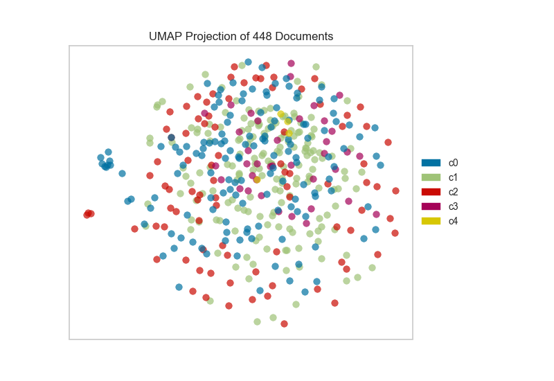
On one hand, these clusters aren’t particularly well concentrated by the two-dimensional embedding of UMAP; while on the other hand, the true labels for this data are. That is a good indication that your data does indeed live on a manifold in your TF-IDF space and that structure is being ignored by the K-Means algorithm. Clustering can be quite tricky in high dimensional spaces and it is often a good idea to reduce your dimension before running clustering algorithms on your data.
UMAP, it should be noted, is a manifold learning technique and as such does not seek to preserve the distances between your data points in high space but instead to learn the distances along an underlying manifold on which your data points lie. As such, one shouldn’t be too surprised when it disagrees with a non-manifold based clustering technique. A detailed explanation of this phenomenon can be found in this UMAP documentation.
Quick Method
The same functionality above can be achieved with the associated quick method umap. This method will build the UMAPVisualizer object with the associated arguments, fit it, then (optionally) immediately show it
from sklearn.cluster import KMeans
from sklearn.feature_extraction.text import TfidfVectorizer

from yellowbrick.text import umap
from yellowbrick.datasets import load_hobbies

# Load the text data
corpus = load_hobbies()

tfidf = TfidfVectorizer()
docs = tfidf.fit_transform(corpus.data)

# Instantiate the clustering model
clusters = KMeans(n_clusters=5)
clusters.fit(docs)

viz = umap(docs, ["c{}".format(c) for c in clusters.labels_])
(Source code, png, pdf)

API Reference
Implements UMAP visualizations of documents in 2D space.
- class yellowbrick.text.umap_vis.UMAPVisualizer(ax=None, labels=None, classes=None, colors=None, colormap=None, random_state=None, alpha=0.7, **kwargs)[source]
Bases:
TextVisualizerDisplay a projection of a vectorized corpus in two dimensions using UMAP (Uniform Manifold Approximation and Projection), a nonlinear dimensionality reduction method that is particularly well suited to embedding in two or three dimensions for visualization as a scatter plot. UMAP is a relatively new technique but is often used to visualize clusters or groups of data points and their relative proximities. It typically is fast, scalable, and can be applied directly to sparse matrices eliminating the need to run a
TruncatedSVDas a pre-processing step.The current default for UMAP is Euclidean distance. Hellinger distance would be a more appropriate distance function to use with CountVectorize data. That will be released in a forthcoming version of UMAP. In the meantime cosine distance is likely a better text default that Euclidean and can be set using the keyword argument
metric='cosine'.For more, see https://github.com/lmcinnes/umap
- Parameters
- axmatplotlib axes
The axes to plot the figure on.
- labelslist of strings
The names of the classes in the target, used to create a legend. Labels must match names of classes in sorted order.
- colorslist or tuple of colors
Specify the colors for each individual class
- colormapstring or matplotlib cmap
Sequential colormap for continuous target
- random_stateint, RandomState instance or None, optional, default: None
If int, random_state is the seed used by the random number generator; If RandomState instance, random_state is the random number generator; If None, the random number generator is the RandomState instance used by np.random. The random state is applied to the preliminary decomposition as well as UMAP.
- alphafloat, default: 0.7
Specify a transparency where 1 is completely opaque and 0 is completely transparent. This property makes densely clustered points more visible.
- kwargsdict
Pass any additional keyword arguments to the UMAP transformer.
Examples
>>> model = MyVisualizer(metric='cosine')
>>> model.fit(X)
>>> model.show()
- NULL_CLASS = None
- draw(points, target=None, **kwargs)[source]
Called from the fit method, this method draws the UMAP scatter plot, from a set of decomposed points in 2 dimensions. This method also accepts a third dimension, target, which is used to specify the colors of each of the points. If the target is not specified, then the points are plotted as a single cloud to show similar documents.
- finalize(**kwargs)[source]
Finalize the drawing by adding a title and legend, and removing the axes objects that do not convey information about UMAP.
- fit(X, y=None, **kwargs)[source]
The fit method is the primary drawing input for the UMAP projection since the visualization requires both X and an optional y value. The fit method expects an array of numeric vectors, so text documents must be vectorized before passing them to this method.
- Parameters
- Xndarray or DataFrame of shape n x m
A matrix of n instances with m features representing the corpus of vectorized documents to visualize with UMAP.
- yndarray or Series of length n
An optional array or series of target or class values for instances. If this is specified, then the points will be colored according to their class. Often cluster labels are passed in to color the documents in cluster space, so this method is used both for classification and clustering methods.
- kwargsdict
Pass generic arguments to the drawing method
- Returns
- selfinstance
Returns the instance of the transformer/visualizer
- make_transformer(umap_kwargs={})[source]
Creates an internal transformer pipeline to project the data set into 2D space using UMAP. This method will reset the transformer on the class.
- Parameters
- umap_kwargsdict
Keyword arguments for the internal UMAP transformer
- Returns
- transformerPipeline
Pipelined transformer for UMAP projections
- yellowbrick.text.umap_vis.umap(X, y=None, ax=None, classes=None, colors=None, colormap=None, alpha=0.7, show=True, **kwargs)[source]
Display a projection of a vectorized corpus in two dimensions using UMAP (Uniform Manifold Approximation and Projection), a nonlinear dimensionality reduction method that is particularly well suited to embedding in two or three dimensions for visualization as a scatter plot. UMAP is a relatively new technique but is often used to visualize clusters or groups of data points and their relative proximities. It typically is fast, scalable, and can be applied directly to sparse matrices eliminating the need to run a
TruncatedSVDas a pre-processing step.The current default for UMAP is Euclidean distance. Hellinger distance would be a more appropriate distance function to use with CountVectorize data. That will be released in a forthcoming version of UMAP. In the meantime cosine distance is likely a better text default that Euclidean and can be set using the keyword argument
metric='cosine'.- Parameters
- Xndarray or DataFrame of shape n x m
A matrix of n instances with m features representing the corpus of vectorized documents to visualize with umap.
- yndarray or Series of length n
An optional array or series of target or class values for instances. If this is specified, then the points will be colored according to their class. Often cluster labels are passed in to color the documents in cluster space, so this method is used both for classification and clustering methods.
- axmatplotlib axes
The axes to plot the figure on.
- classeslist of strings
The names of the classes in the target, used to create a legend.
- colorslist or tuple of colors
Specify the colors for each individual class
- colormapstring or matplotlib cmap
Sequential colormap for continuous target
- alphafloat, default: 0.7
Specify a transparency where 1 is completely opaque and 0 is completely transparent. This property makes densely clustered points more visible.
- showbool, default: True
If True, calls
show(), which in turn callsplt.show()however you cannot callplt.savefigfrom this signature, norclear_figure. If False, simply callsfinalize()- kwargsdict
Pass any additional keyword arguments to the UMAP transformer.
- ——-
- visualizer: UMAPVisualizer
Returns the fitted, finalized visualizer