Silhouette Visualizer
The Silhouette Coefficient is used when the ground-truth about the dataset is unknown and computes the density of clusters computed by the model. The score is computed by averaging the silhouette coefficient for each sample, computed as the difference between the average intra-cluster distance and the mean nearest-cluster distance for each sample, normalized by the maximum value. This produces a score between 1 and -1, where 1 is highly dense clusters and -1 is completely incorrect clustering.
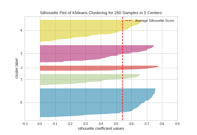
The Silhouette Visualizer displays the silhouette coefficient for each sample on a per-cluster basis, visualizing which clusters are dense and which are not. This is particularly useful for determining cluster imbalance, or for selecting a value for \(K\) by comparing multiple visualizers.
Visualizer |
|
Quick Method |
|
Models |
Clustering |
Workflow |
Model evaluation |
Examples and demo
from sklearn.cluster import KMeans

from yellowbrick.cluster import SilhouetteVisualizer
from yellowbrick.datasets import load_nfl

# Load a clustering dataset
X, y = load_nfl()

# Specify the features to use for clustering
features = ['Rec', 'Yds', 'TD', 'Fmb', 'Ctch_Rate']
X = X.query('Tgt >= 20')[features]

# Instantiate the clustering model and visualizer
model = KMeans(5, random_state=42)
visualizer = SilhouetteVisualizer(model, colors='yellowbrick')

visualizer.fit(X)        # Fit the data to the visualizer
visualizer.show()        # Finalize and render the figure
(Source code, png, pdf)
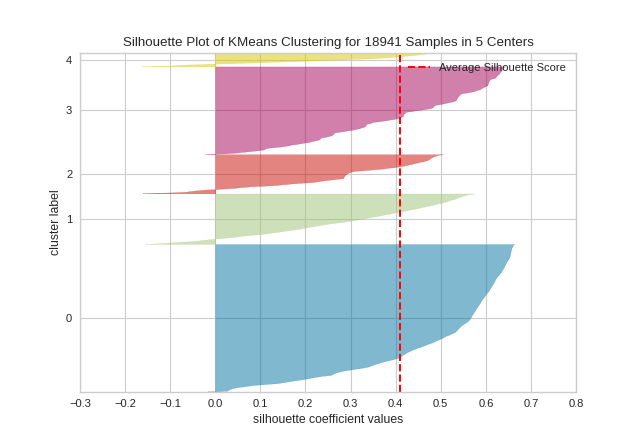
Quick Method
The same functionality above can be achieved with the associated quick method silhouette_visualizer. This method will build the Silhouette Visualizer object with the associated arguments, fit it, then (optionally) immediately show it.
from sklearn.cluster import KMeans

from yellowbrick.cluster import silhouette_visualizer
from yellowbrick.datasets import load_credit

# Load a clustering dataset
X, y = load_credit()

# Specify rows to cluster: under 40 y/o and have either graduate or university education
X = X[(X['age'] <= 40) & (X['edu'].isin([1,2]))]

# Use the quick method and immediately show the figure
silhouette_visualizer(KMeans(5, random_state=42), X, colors='yellowbrick')
(Source code, png, pdf)
API Reference
Implements visualizers that use the silhouette metric for cluster evaluation.
- class yellowbrick.cluster.silhouette.SilhouetteVisualizer(estimator, ax=None, colors=None, is_fitted='auto', **kwargs)[source]
Bases:
ClusteringScoreVisualizerThe Silhouette Visualizer displays the silhouette coefficient for each sample on a per-cluster basis, visually evaluating the density and separation between clusters. The score is calculated by averaging the silhouette coefficient for each sample, computed as the difference between the average intra-cluster distance and the mean nearest-cluster distance for each sample, normalized by the maximum value. This produces a score between -1 and +1, where scores near +1 indicate high separation and scores near -1 indicate that the samples may have been assigned to the wrong cluster.
In SilhouetteVisualizer plots, clusters with higher scores have wider silhouettes, but clusters that are less cohesive will fall short of the average score across all clusters, which is plotted as a vertical dotted red line.
This is particularly useful for determining cluster imbalance, or for selecting a value for K by comparing multiple visualizers.
- Parameters
- estimatora Scikit-Learn clusterer
Should be an instance of a centroidal clustering algorithm (
KMeansorMiniBatchKMeans). If the estimator is not fitted, it is fit when the visualizer is fitted, unless otherwise specified byis_fitted.- axmatplotlib Axes, default: None
The axes to plot the figure on. If None is passed in the current axes will be used (or generated if required).
- colorsiterable or string, default: None
A collection of colors to use for each cluster group. If there are fewer colors than cluster groups, colors will repeat. May also be a Yellowbrick or matplotlib colormap string.
- is_fittedbool or str, default=’auto’
Specify if the wrapped estimator is already fitted. If False, the estimator will be fit when the visualizer is fit, otherwise, the estimator will not be modified. If ‘auto’ (default), a helper method will check if the estimator is fitted before fitting it again.
- kwargsdict
Keyword arguments that are passed to the base class and may influence the visualization as defined in other Visualizers.
Examples
>>> from yellowbrick.cluster import SilhouetteVisualizer
>>> from sklearn.cluster import KMeans
>>> model = SilhouetteVisualizer(KMeans(10))
>>> model.fit(X)
>>> model.show()
- Attributes
- silhouette_score_float
Mean Silhouette Coefficient for all samples. Computed via scikit-learn sklearn.metrics.silhouette_score.
- silhouette_samples_array, shape = [n_samples]
Silhouette Coefficient for each samples. Computed via scikit-learn sklearn.metrics.silhouette_samples.
- n_samples_integer
Number of total samples in the dataset (X.shape[0])
- n_clusters_integer
Number of clusters (e.g. n_clusters or k value) passed to internal scikit-learn model.
- y_tick_pos_array of shape (n_clusters,)
The computed center positions of each cluster on the y-axis
- draw(labels)[source]
Draw the silhouettes for each sample and the average score.
- Parameters
- labelsarray-like
An array with the cluster label for each silhouette sample, usually computed with
predict(). Labels are not stored on the visualizer so that the figure can be redrawn with new data.
- yellowbrick.cluster.silhouette.silhouette_visualizer(estimator, X, y=None, ax=None, colors=None, is_fitted='auto', show=True, **kwargs)[source]
Quick Method: The Silhouette Visualizer displays the silhouette coefficient for each sample on a per-cluster basis, visually evaluating the density and separation between clusters. The score is calculated by averaging the silhouette coefficient for each sample, computed as the difference between the average intra-cluster distance and the mean nearest-cluster distance for each sample, normalized by the maximum value. This produces a score between -1 and +1, where scores near +1 indicate high separation and scores near -1 indicate that the samples may have been assigned to the wrong cluster.
- Parameters
- estimatora Scikit-Learn clusterer
Should be an instance of a centroidal clustering algorithm (
KMeansorMiniBatchKMeans). If the estimator is not fitted, it is fit when the visualizer is fitted, unless otherwise specified byis_fitted.- Xarray-like of shape (n, m)
A matrix or data frame with n instances and m features
- yarray-like of shape (n,), optional
A vector or series representing the target for each instance
- axmatplotlib Axes, default: None
The axis to plot the figure on. If None is passed in the current axes will be used (or generated if required).
- colorsiterable or string, default: None
A collection of colors to use for each cluster group. If there are fewer colors than cluster groups, colors will repeat. May also be a Yellowbrick or matplotlib colormap string.
- is_fittedbool or str, default=’auto’
Specify if the wrapped estimator is already fitted. If False, the estimator will be fit when the visualizer is fit, otherwise, the estimator will not be modified. If ‘auto’ (default), a helper method will check if the estimator is fitted before fitting it again.
- showbool, default: True
If True, calls
show(), which in turn callsplt.show()however you cannot callplt.savefigfrom this signature, norclear_figure. If False, simply callsfinalize()- kwargsdict
Keyword arguments that are passed to the base class and may influence the visualization as defined in other Visualizers.
- Returns
- vizSilhouetteVisualizer
The silhouette visualizer, fitted and finalized.