Oneliners
Yellowbrick’s quick methods are visualizers in a single line of code!
Yellowbrick is designed to give you as much control as you would like over the plots you create, offering parameters to help you customize everything from color, size, and title to preferred evaluation or correlation measure, optional bestfit lines or histograms, and cross validation techniques. To learn more about how to customize your visualizations using those parameters, check out the Visualizers and API.
But… sometimes you just want to build a plot with a single line of code!
On this page we’ll explore the Yellowbrick quick methods (aka “oneliners”), which return a fully fitted, finalized visualizer object in only a single line.
Note
This page illustrates oneliners for some of our most popular visualizers for feature analysis, classification, regression, clustering, and target evaluation, but is not a comprehensive list. Nearly every Yellowbrick visualizer has an associated quick method!
Feature Analysis
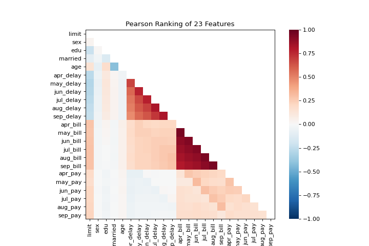
Rank2D
The rank1d and rank2d plots show pairwise rankings of features to help you detect relationships. More about Rank Features.
from yellowbrick.features import rank2d
from yellowbrick.datasets import load_credit


X, _ = load_credit()
visualizer = rank2d(X)
(Source code, png, pdf)
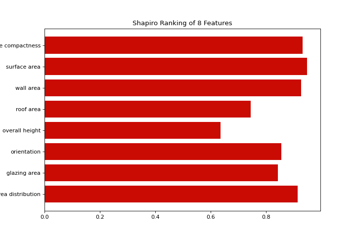
from yellowbrick.features import rank1d
from yellowbrick.datasets import load_energy


X, _ = load_energy()
visualizer = rank1d(X, color="r")
(Source code, png, pdf)
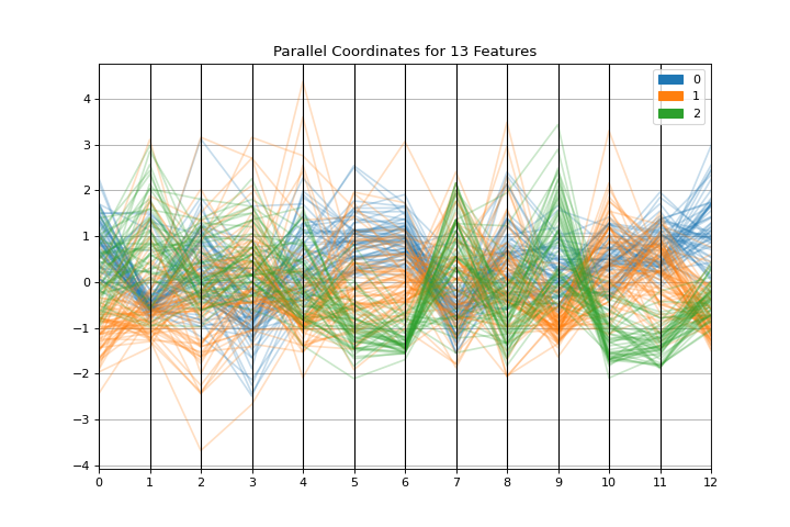
Parallel Coordinates
The parallel_coordinates plot is a horizontal visualization of instances, disaggregated by the features that describe them. More about Parallel Coordinates.
from sklearn.datasets import load_wine
from yellowbrick.features import parallel_coordinates


X, y = load_wine(return_X_y=True)
visualizer = parallel_coordinates(X, y, normalize="standard")
(Source code, png, pdf)

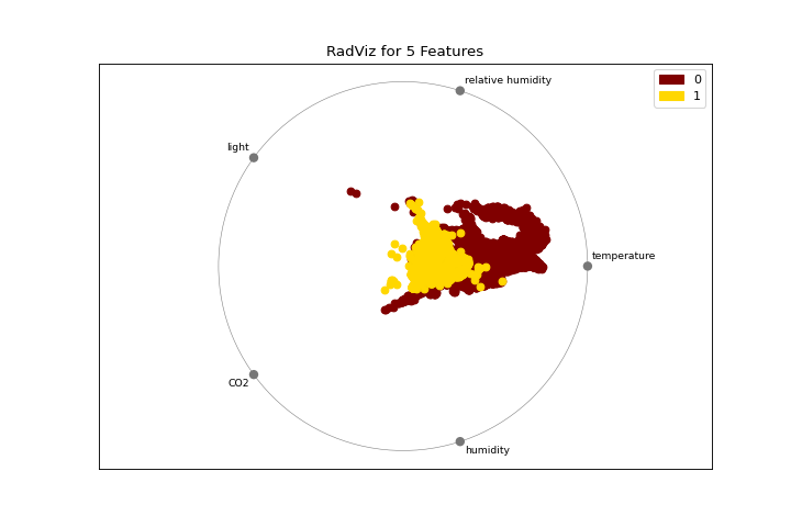
Radial Visualization
The radviz plot shows the separation of instances around a unit circle. More about RadViz Visualizer.
from yellowbrick.features import radviz
from yellowbrick.datasets import load_occupancy


X, y = load_occupancy()
visualizer = radviz(X, y, colors=["maroon", "gold"])
(Source code, png, pdf)
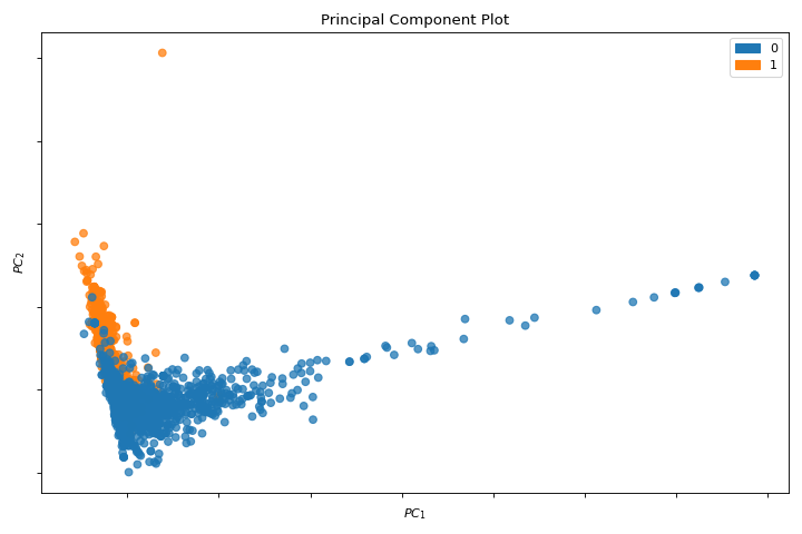
PCA
A pca_decomposition is a projection of instances based on principal components. More about PCA Projection.
from yellowbrick.datasets import load_spam
from yellowbrick.features import pca_decomposition


X, y = load_spam()
visualizer = pca_decomposition(X, y)
(Source code, png, pdf)

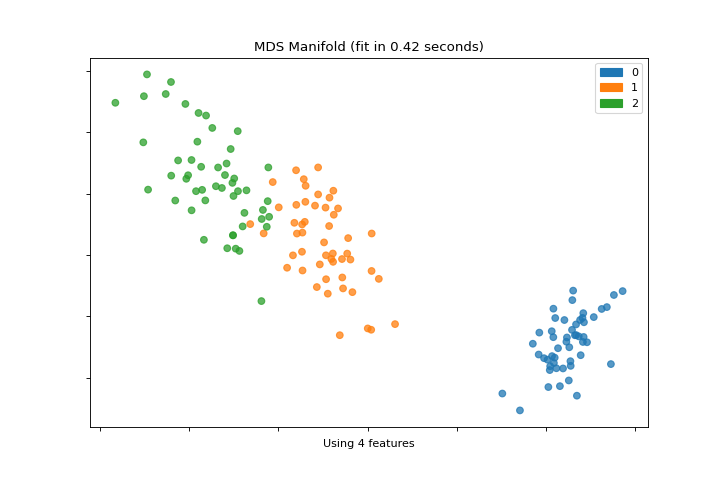
Manifold
The manifold_embedding plot is a high dimensional visualization with manifold learning, which can show nonlinear relationships in the features. More about Manifold Visualization.
from sklearn.datasets import load_iris
from yellowbrick.features import manifold_embedding


X, y = load_iris(return_X_y=True)
visualizer = manifold_embedding(X, y)
(Source code, png, pdf)

Classification
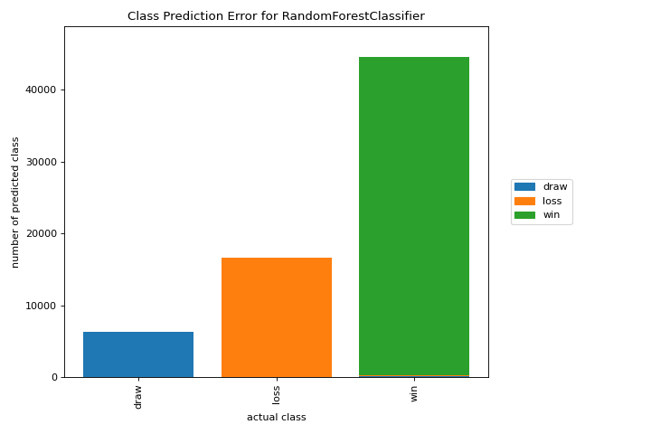
Class Prediction Error
A class_prediction_error plot illustrates the error and support in a classification as a bar chart. More about Class Prediction Error.
from yellowbrick.datasets import load_game
from sklearn.preprocessing import OneHotEncoder
from sklearn.ensemble import RandomForestClassifier
from yellowbrick.classifier import class_prediction_error


X, y = load_game()
X = OneHotEncoder().fit_transform(X)
visualizer = class_prediction_error(
    RandomForestClassifier(n_estimators=10), X, y
)
(Source code, png, pdf)

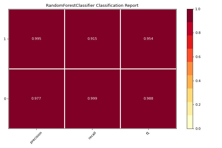
Classification Report
A classification_report is a visual representation of precision, recall, and F1 score. More about Classification Report.
from yellowbrick.datasets import load_credit
from sklearn.ensemble import RandomForestClassifier
from yellowbrick.classifier import classification_report


X, y = load_credit()
visualizer = classification_report(
    RandomForestClassifier(n_estimators=10), X, y
)
(Source code, png, pdf)

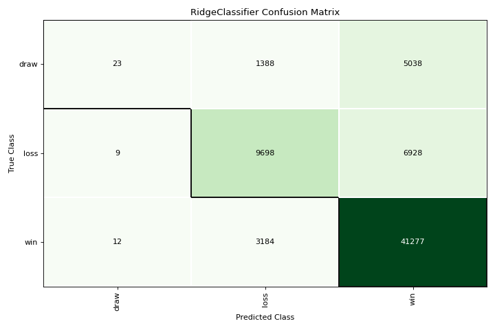
Confusion Matrix
A confusion_matrix is a visual description of per-class decision making. More about Confusion Matrix.
from yellowbrick.datasets import load_game
from sklearn.preprocessing import OneHotEncoder
from sklearn.linear_model import RidgeClassifier
from yellowbrick.classifier import confusion_matrix


X, y = load_game()
X = OneHotEncoder().fit_transform(X)
visualizer = confusion_matrix(RidgeClassifier(), X, y, cmap="Greens")
(Source code, png, pdf)
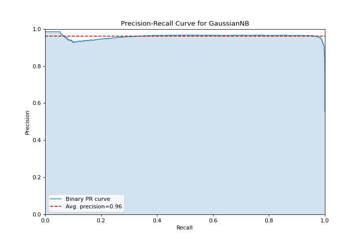
Precision Recall
A precision_recall_curve shows the tradeoff between precision and recall for different probability thresholds. More about Precision-Recall Curves.
from sklearn.naive_bayes import GaussianNB
from yellowbrick.datasets import load_occupancy
from yellowbrick.classifier import precision_recall_curve


X, y = load_occupancy()
visualizer = precision_recall_curve(GaussianNB(), X, y)
(Source code, png, pdf)
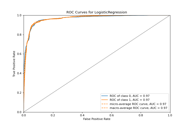
ROCAUC
A roc_auc plot shows the receiver operator characteristics and area under the curve. More about ROCAUC.
from yellowbrick.classifier import roc_auc
from yellowbrick.datasets import load_spam
from sklearn.linear_model import LogisticRegression


X, y = load_spam()
visualizer = roc_auc(LogisticRegression(), X, y)
(Source code, png, pdf)
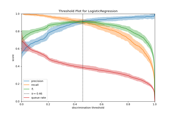
Discrimination Threshold
A discrimination_threshold plot can help find a threshold that best separates binary classes. More about Discrimination Threshold.
from yellowbrick.classifier import discrimination_threshold
from sklearn.linear_model import LogisticRegression
from yellowbrick.datasets import load_spam

X, y = load_spam()
visualizer = discrimination_threshold(
    LogisticRegression(multi_class="auto", solver="liblinear"), X, y
)
(Source code, png, pdf)
Regression
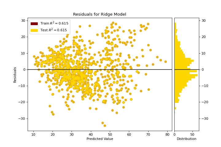
Residuals Plot
A residuals_plot shows the difference in residuals between the training and test data. More about Residuals Plot.
from sklearn.linear_model import Ridge
from yellowbrick.datasets import load_concrete
from yellowbrick.regressor import residuals_plot


X, y = load_concrete()
visualizer = residuals_plot(
    Ridge(), X, y, train_color="maroon", test_color="gold"
)
(Source code, png, pdf)
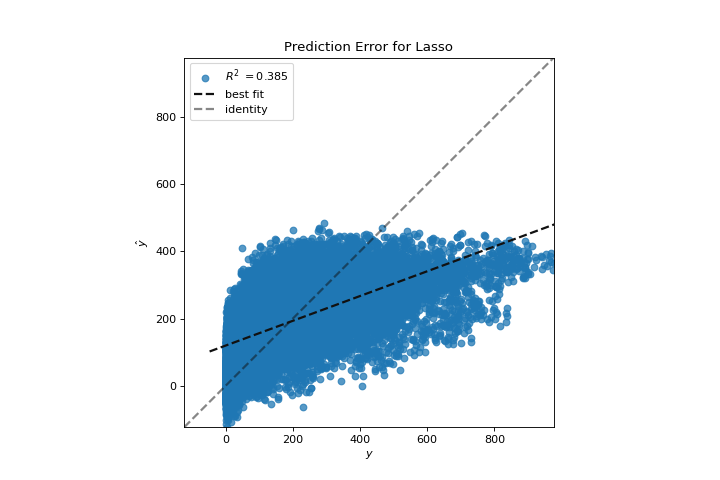
Prediction Error
A prediction_error helps find where the regression is making the most errors. More about Prediction Error Plot.
from sklearn.linear_model import Lasso
from yellowbrick.datasets import load_bikeshare
from yellowbrick.regressor import prediction_error


X, y = load_bikeshare()
visualizer = prediction_error(Lasso(), X, y)
(Source code, png, pdf)
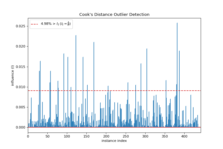
Cooks Distance
A cooks_distance plot shows the influence of instances on linear regression. More about Cook’s Distance.
from sklearn.datasets import load_diabetes
from yellowbrick.regressor import cooks_distance


X, y = load_diabetes(return_X_y=True)
visualizer = cooks_distance(X, y)
(Source code, png, pdf)
Clustering
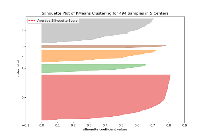
Silhouette Scores
A silhouette_visualizer can help you select k by visualizing silhouette coefficient values. More about Silhouette Visualizer.
from sklearn.cluster import KMeans
from yellowbrick.datasets import load_nfl
from yellowbrick.cluster import silhouette_visualizer

X, y = load_nfl()
visualizer = silhouette_visualizer(KMeans(5, random_state=42), X)
(Source code, png, pdf)
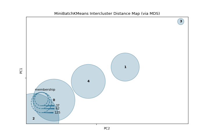
Intercluster Distance
A intercluster_distance shows size and relative distance between clusters. More about Intercluster Distance Maps.
from yellowbrick.datasets import load_nfl
from sklearn.cluster import MiniBatchKMeans
from yellowbrick.cluster import intercluster_distance


X, y = load_nfl()
visualizer = intercluster_distance(MiniBatchKMeans(5, random_state=777), X)
(Source code, png, pdf)

Target Analysis
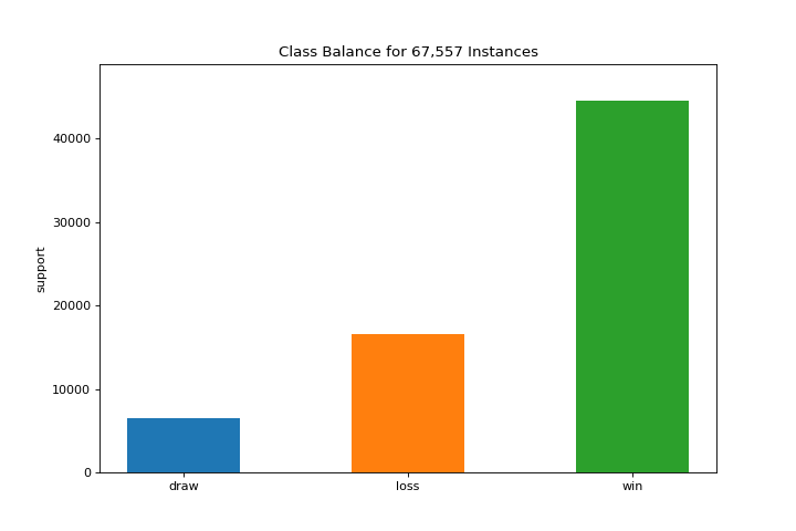
ClassBalance
The class_balance plot can make it easier to see how the distribution of classes may affect the model. More about Class Balance.
from yellowbrick.datasets import load_game
from yellowbrick.target import class_balance


X, y = load_game()
visualizer = class_balance(y, labels=["draw", "loss", "win"])
(Source code, png, pdf)