Residuals Plot
Residuals, in the context of regression models, are the difference between the observed value of the target variable (y) and the predicted value (ŷ), i.e. the error of the prediction. The residuals plot shows the difference between residuals on the vertical axis and the dependent variable on the horizontal axis, allowing you to detect regions within the target that may be susceptible to more or less error.
Visualizer |
|
Quick Method |
|
Models |
Regression |
Workflow |
Model evaluation |
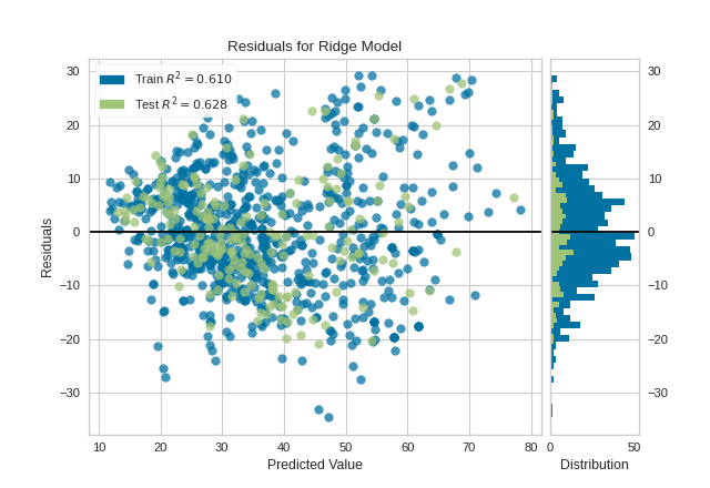
from sklearn.linear_model import Ridge
from sklearn.model_selection import train_test_split

from yellowbrick.datasets import load_concrete
from yellowbrick.regressor import ResidualsPlot

# Load a regression dataset
X, y = load_concrete()

# Create the train and test data
X_train, X_test, y_train, y_test = train_test_split(X, y, test_size=0.2, random_state=42)

# Instantiate the linear model and visualizer
model = Ridge()
visualizer = ResidualsPlot(model)

visualizer.fit(X_train, y_train)  # Fit the training data to the visualizer
visualizer.score(X_test, y_test)  # Evaluate the model on the test data
visualizer.show()                 # Finalize and render the figure
(Source code, png, pdf)

A common use of the residuals plot is to analyze the variance of the error of the regressor. If the points are randomly dispersed around the horizontal axis, a linear regression model is usually appropriate for the data; otherwise, a non-linear model is more appropriate. In the case above, we see a fairly random, uniform distribution of the residuals against the target in two dimensions. This seems to indicate that our linear model is performing well. We can also see from the histogram that our error is normally distributed around zero, which also generally indicates a well fitted model.
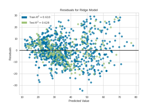
Note that if the histogram is not desired, it can be turned off with the hist=False flag:
visualizer = ResidualsPlot(model, hist=False)
visualizer.fit(X_train, y_train)
visualizer.score(X_test, y_test)
visualizer.show()
(Source code, png, pdf)
Warning
The histogram on the residuals plot requires matplotlib 2.0.2 or greater. If you are using an earlier version of matplotlib, simply set the hist=False flag so that the histogram is not drawn.
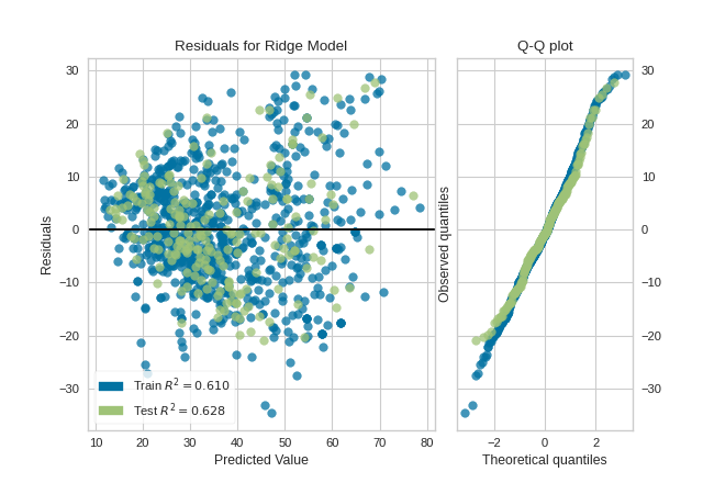
Histogram can be replaced with a Q-Q plot, which is a common way to check that residuals are normally distributed. If the residuals are normally distributed, then their quantiles when plotted against quantiles of normal distribution should form a straight line. The example below shows, how Q-Q plot can be drawn with a qqplot=True flag. Notice that hist has to be set to False in this case.
visualizer = ResidualsPlot(model, hist=False, qqplot=True)
visualizer.fit(X_train, y_train)
visualizer.score(X_test, y_test)
visualizer.show()
(Source code, png, pdf)

Quick Method
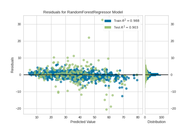
Similar functionality as above can be achieved in one line using the associated quick method, residuals_plot. This method will instantiate and fit a ResidualsPlot visualizer on the training data, then will score it on the optionally provided test data (or the training data if it is not provided).
from sklearn.ensemble import RandomForestRegressor
from sklearn.model_selection import train_test_split as tts

from yellowbrick.datasets import load_concrete
from yellowbrick.regressor import residuals_plot

# Load the dataset and split into train/test splits
X, y = load_concrete()

X_train, X_test, y_train, y_test = tts(X, y, test_size=0.2, shuffle=True)

# Create the visualizer, fit, score, and show it
viz = residuals_plot(RandomForestRegressor(), X_train, y_train, X_test, y_test)
(Source code, png, pdf)

API Reference
Visualize the residuals between predicted and actual data for regression problems
- class yellowbrick.regressor.residuals.ResidualsPlot(estimator, ax=None, hist=True, qqplot=False, train_color='b', test_color='g', line_color='#111111', train_alpha=0.75, test_alpha=0.75, is_fitted='auto', **kwargs)[source]
Bases:
RegressionScoreVisualizerA residual plot shows the residuals on the vertical axis and the independent variable on the horizontal axis.
If the points are randomly dispersed around the horizontal axis, a linear regression model is appropriate for the data; otherwise, a non-linear model is more appropriate.
- Parameters
- estimatora Scikit-Learn regressor
Should be an instance of a regressor, otherwise will raise a YellowbrickTypeError exception on instantiation. If the estimator is not fitted, it is fit when the visualizer is fitted, unless otherwise specified by
is_fitted.- axmatplotlib Axes, default: None
The axes to plot the figure on. If None is passed in the current axes will be used (or generated if required).
- hist{True, False, None, ‘density’, ‘frequency’}, default: True
Draw a histogram showing the distribution of the residuals on the right side of the figure. Requires Matplotlib >= 2.0.2. If set to ‘density’, the probability density function will be plotted. If set to True or ‘frequency’ then the frequency will be plotted.
- qqplot{True, False}, default: False
Draw a Q-Q plot on the right side of the figure, comparing the quantiles of the residuals against quantiles of a standard normal distribution. Q-Q plot and histogram of residuals can not be plotted simultaneously, either hist or qqplot has to be set to False.
- train_colorcolor, default: ‘b’
Residuals for training data are ploted with this color but also given an opacity of 0.5 to ensure that the test data residuals are more visible. Can be any matplotlib color.
- test_colorcolor, default: ‘g’
Residuals for test data are plotted with this color. In order to create generalizable models, reserved test data residuals are of the most analytical interest, so these points are highlighted by having full opacity. Can be any matplotlib color.
- line_colorcolor, default: dark grey
Defines the color of the zero error line, can be any matplotlib color.
- train_alphafloat, default: 0.75
Specify a transparency for traininig data, where 1 is completely opaque and 0 is completely transparent. This property makes densely clustered points more visible.
- test_alphafloat, default: 0.75
Specify a transparency for test data, where 1 is completely opaque and 0 is completely transparent. This property makes densely clustered points more visible.
- is_fittedbool or str, default=’auto’
Specify if the wrapped estimator is already fitted. If False, the estimator will be fit when the visualizer is fit, otherwise, the estimator will not be modified. If ‘auto’ (default), a helper method will check if the estimator is fitted before fitting it again.
- kwargsdict
Keyword arguments that are passed to the base class and may influence the visualization as defined in other Visualizers.
Notes
ResidualsPlot is a ScoreVisualizer, meaning that it wraps a model and its primary entry point is the
score()method.The residuals histogram feature requires matplotlib 2.0.2 or greater.
Examples
>>> from yellowbrick.regressor import ResidualsPlot
>>> from sklearn.linear_model import Ridge
>>> model = ResidualsPlot(Ridge())
>>> model.fit(X_train, y_train)
>>> model.score(X_test, y_test)
>>> model.show()
- Attributes
- train_score_float
The R^2 score that specifies the goodness of fit of the underlying regression model to the training data.
- test_score_float
The R^2 score that specifies the goodness of fit of the underlying regression model to the test data.
- draw(y_pred, residuals, train=False, **kwargs)[source]
Draw the residuals against the predicted value for the specified split. It is best to draw the training split first, then the test split so that the test split (usually smaller) is above the training split; particularly if the histogram is turned on.
- Parameters
- y_predndarray or Series of length n
An array or series of predicted target values
- residualsndarray or Series of length n
An array or series of the difference between the predicted and the target values
- trainboolean, default: False
If False, draw assumes that the residual points being plotted are from the test data; if True, draw assumes the residuals are the train data.
- Returns
- axmatplotlib Axes
The axis with the plotted figure
- finalize(**kwargs)[source]
Prepares the plot for rendering by adding a title, legend, and axis labels. Also draws a line at the zero residuals to show the baseline.
- Parameters
- kwargs: generic keyword arguments.
Notes
Generally this method is called from show and not directly by the user.
- fit(X, y, **kwargs)[source]
- Parameters
- Xndarray or DataFrame of shape n x m
A matrix of n instances with m features
- yndarray or Series of length n
An array or series of target values
- kwargs: keyword arguments passed to Scikit-Learn API.
- Returns
- selfResidualsPlot
The visualizer instance
- property hax
Returns the histogram axes, creating it only on demand.
- property qqax
Returns the Q-Q plot axes, creating it only on demand.
- score(X, y=None, train=False, **kwargs)[source]
Generates predicted target values using the Scikit-Learn estimator.
- Parameters
- Xarray-like
X (also X_test) are the dependent variables of test set to predict
- yarray-like
y (also y_test) is the independent actual variables to score against
- trainboolean
If False, score assumes that the residual points being plotted are from the test data; if True, score assumes the residuals are the train data.
- Returns
- scorefloat
The score of the underlying estimator, usually the R-squared score for regression estimators.
- yellowbrick.regressor.residuals.residuals_plot(estimator, X_train, y_train, X_test=None, y_test=None, ax=None, hist=True, qqplot=False, train_color='b', test_color='g', line_color='#111111', train_alpha=0.75, test_alpha=0.75, is_fitted='auto', show=True, **kwargs)[source]
ResidualsPlot quick method:
A residual plot shows the residuals on the vertical axis and the independent variable on the horizontal axis.
If the points are randomly dispersed around the horizontal axis, a linear regression model is appropriate for the data; otherwise, a non-linear model is more appropriate.
- Parameters
- estimatora Scikit-Learn regressor
Should be an instance of a regressor, otherwise will raise a YellowbrickTypeError exception on instantiation. If the estimator is not fitted, it is fit when the visualizer is fitted, unless otherwise specified by
is_fitted.- X_trainndarray or DataFrame of shape n x m
A feature array of n instances with m features the model is trained on. Used to fit the visualizer and also to score the visualizer if test splits are not directly specified.
- y_trainndarray or Series of length n
An array or series of target or class values. Used to fit the visualizer and also to score the visualizer if test splits are not specified.
- X_testndarray or DataFrame of shape n x m, default: None
An optional feature array of n instances with m features that the model is scored on if specified, using X_train as the training data.
- y_testndarray or Series of length n, default: None
An optional array or series of target or class values that serve as actual labels for X_test for scoring purposes.
- axmatplotlib Axes, default: None
The axes to plot the figure on. If None is passed in the current axes will be used (or generated if required).
- hist{True, False, None, ‘density’, ‘frequency’}, default: True
Draw a histogram showing the distribution of the residuals on the right side of the figure. Requires Matplotlib >= 2.0.2. If set to ‘density’, the probability density function will be plotted. If set to True or ‘frequency’ then the frequency will be plotted.
- qqplot{True, False}, default: False
Draw a Q-Q plot on the right side of the figure, comparing the quantiles of the residuals against quantiles of a standard normal distribution. Q-Q plot and histogram of residuals can not be plotted simultaneously, either hist or qqplot has to be set to False.
- train_colorcolor, default: ‘b’
Residuals for training data are ploted with this color but also given an opacity of 0.5 to ensure that the test data residuals are more visible. Can be any matplotlib color.
- test_colorcolor, default: ‘g’
Residuals for test data are plotted with this color. In order to create generalizable models, reserved test data residuals are of the most analytical interest, so these points are highlighted by having full opacity. Can be any matplotlib color.
- line_colorcolor, default: dark grey
Defines the color of the zero error line, can be any matplotlib color.
- train_alphafloat, default: 0.75
Specify a transparency for traininig data, where 1 is completely opaque and 0 is completely transparent. This property makes densely clustered points more visible.
- test_alphafloat, default: 0.75
Specify a transparency for test data, where 1 is completely opaque and 0 is completely transparent. This property makes densely clustered points more visible.
- is_fittedbool or str, default=’auto’
Specify if the wrapped estimator is already fitted. If False, the estimator will be fit when the visualizer is fit, otherwise, the estimator will not be modified. If ‘auto’ (default), a helper method will check if the estimator is fitted before fitting it again.
- show: bool, default: True
If True, calls
show(), which in turn callsplt.show()however you cannot callplt.savefigfrom this signature, norclear_figure. If False, simply callsfinalize()- kwargsdict
Keyword arguments that are passed to the base class and may influence the visualization as defined in other Visualizers.
- Returns
- vizResidualsPlot
Returns the fitted ResidualsPlot that created the figure.