Prediction Error Plot
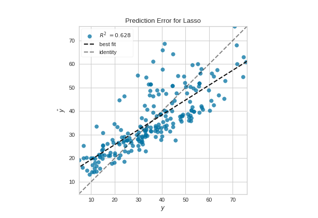
A prediction error plot shows the actual targets from the dataset against the predicted values generated by our model. This allows us to see how much variance is in the model. Data scientists can diagnose regression models using this plot by comparing against the 45 degree line, where the prediction exactly matches the model.
Visualizer |
|
Quick Method |
|
Models |
Regression |
Workflow |
Model Evaluation |
from sklearn.linear_model import Lasso
from sklearn.model_selection import train_test_split

from yellowbrick.datasets import load_concrete
from yellowbrick.regressor import PredictionError

# Load a regression dataset
X, y = load_concrete()

# Create the train and test data
X_train, X_test, y_train, y_test = train_test_split(X, y, test_size=0.2, random_state=42)

# Instantiate the linear model and visualizer
model = Lasso()
visualizer = PredictionError(model)

visualizer.fit(X_train, y_train)  # Fit the training data to the visualizer
visualizer.score(X_test, y_test)  # Evaluate the model on the test data
visualizer.show()                 # Finalize and render the figure
(Source code, png, pdf)

Quick Method
The same functionality can be achieved with the associated quick method prediction_error. This method will build the PredictionError object with the associated arguments, fit it, then (optionally) immediately show the visualization.
from sklearn.linear_model import Lasso
from sklearn.model_selection import train_test_split

from yellowbrick.datasets import load_concrete
from yellowbrick.regressor import prediction_error

# Load a regression dataset
X, y = load_concrete()

# Create the train and test data
X_train, X_test, y_train, y_test = train_test_split(X, y, test_size=0.2, random_state=42)

# Instantiate the linear model and visualizer
model = Lasso()
visualizer = prediction_error(model, X_train, y_train, X_test, y_test)
(Source code, png, pdf)

API Reference
Comparison of the predicted vs. actual values for regression problems
- class yellowbrick.regressor.prediction_error.PredictionError(estimator, ax=None, shared_limits=True, bestfit=True, identity=True, alpha=0.75, is_fitted='auto', **kwargs)[source]
Bases:
RegressionScoreVisualizerThe prediction error visualizer plots the actual targets from the dataset against the predicted values generated by our model(s). This visualizer is used to detect noise or heteroscedasticity along a range of the target domain.
- Parameters
- estimatora Scikit-Learn regressor
Should be an instance of a regressor, otherwise will raise a YellowbrickTypeError exception on instantiation. If the estimator is not fitted, it is fit when the visualizer is fitted, unless otherwise specified by
is_fitted.- axmatplotlib Axes, default: None
The axes to plot the figure on. If None is passed in the current axes will be used (or generated if required).
- shared_limitsbool, default: True
If shared_limits is True, the range of the X and Y axis limits will be identical, creating a square graphic with a true 45 degree line. In this form, it is easier to diagnose under- or over- prediction, though the figure will become more sparse. To localize points, set shared_limits to False, but note that this will distort the figure and should be accounted for during analysis.
- bestfitbool, default: True
Draw a linear best fit line to estimate the correlation between the predicted and measured value of the target variable. The color of the bestfit line is determined by the
line_colorargument.- identitybool, default: True
Draw the 45 degree identity line, y=x in order to better show the relationship or pattern of the residuals. E.g. to estimate if the model is over- or under- estimating the given values. The color of the identity line is a muted version of the
line_colorargument.- alphafloat, default: 0.75
Specify a transparency where 1 is completely opaque and 0 is completely transparent. This property makes densely clustered points more visible.
- is_fittedbool or str, default=’auto’
Specify if the wrapped estimator is already fitted. If False, the estimator will be fit when the visualizer is fit, otherwise, the estimator will not be modified. If ‘auto’ (default), a helper method will check if the estimator is fitted before fitting it again.
- kwargsdict
Keyword arguments that are passed to the base class and may influence the visualization as defined in other Visualizers.
Notes
PredictionError is a ScoreVisualizer, meaning that it wraps a model and its primary entry point is the score() method.
Examples
>>> from yellowbrick.regressor import PredictionError
>>> from sklearn.linear_model import Lasso
>>> model = PredictionError(Lasso())
>>> model.fit(X_train, y_train)
>>> model.score(X_test, y_test)
>>> model.show()
- Attributes
- score_float
The R^2 score that specifies the goodness of fit of the underlying regression model to the test data.
- draw(y, y_pred)[source]
- Parameters
- yndarray or Series of length n
An array or series of target or class values
- y_predndarray or Series of length n
An array or series of predicted target values
- Returns
- axmatplotlib Axes
The axis with the plotted figure
- finalize(**kwargs)[source]
Finalizes the figure by ensuring the aspect ratio is correct and adding the identity line for comparison. Also adds a title, axis labels, and the legend.
- Parameters
- kwargs: generic keyword arguments.
Notes
Generally this method is called from show and not directly by the user.
- score(X, y, **kwargs)[source]
The score function is the hook for visual interaction. Pass in test data and the visualizer will create predictions on the data and evaluate them with respect to the test values. The evaluation will then be passed to draw() and the result of the estimator score will be returned.
- Parameters
- Xarray-like
X (also X_test) are the dependent variables of test set to predict
- yarray-like
y (also y_test) is the independent actual variables to score against
- Returns
- scorefloat
- yellowbrick.regressor.prediction_error.prediction_error(estimator, X_train, y_train, X_test=None, y_test=None, ax=None, shared_limits=True, bestfit=True, identity=True, alpha=0.75, is_fitted='auto', show=True, **kwargs)[source]
Quickly plot a prediction error visualizer
Plot the actual targets from the dataset against the predicted values generated by our model(s).
This helper function is a quick wrapper to utilize the PredictionError ScoreVisualizer for one-off analysis.
- Parameters
- estimatorthe Scikit-Learn estimator (should be a regressor)
Should be an instance of a regressor, otherwise will raise a YellowbrickTypeError exception on instantiation. If the estimator is not fitted, it is fit when the visualizer is fitted, unless otherwise specified by
is_fitted.- X_trainndarray or DataFrame of shape n x m
A feature array of n instances with m features the model is trained on. Used to fit the visualizer and also to score the visualizer if test splits are not directly specified.
- y_trainndarray or Series of length n
An array or series of target or class values. Used to fit the visualizer and also to score the visualizer if test splits are not specified.
- X_testndarray or DataFrame of shape n x m, default: None
An optional feature array of n instances with m features that the model is scored on if specified, using X_train as the training data.
- y_testndarray or Series of length n, default: None
An optional array or series of target or class values that serve as actual labels for X_test for scoring purposes.
- axmatplotlib Axes
The axes to plot the figure on.
- shared_limitsbool, default: True
If shared_limits is True, the range of the X and Y axis limits will be identical, creating a square graphic with a true 45 degree line. In this form, it is easier to diagnose under- or over- prediction, though the figure will become more sparse. To localize points, set shared_limits to False, but note that this will distort the figure and should be accounted for during analysis.
- bestfitbool, default: True
Draw a linear best fit line to estimate the correlation between the predicted and measured value of the target variable. The color of the bestfit line is determined by the
line_colorargument.- identity: bool, default: True
Draw the 45 degree identity line, y=x in order to better show the relationship or pattern of the residuals. E.g. to estimate if the model is over- or under- estimating the given values. The color of the identity line is a muted version of the
line_colorargument.- alphafloat, default: 0.75
Specify a transparency where 1 is completely opaque and 0 is completely transparent. This property makes densely clustered points more visible.
- is_fittedbool or str, default=’auto’
Specify if the wrapped estimator is already fitted. If False, the estimator will be fit when the visualizer is fit, otherwise, the estimator will not be modified. If ‘auto’ (default), a helper method will check if the estimator is fitted before fitting it again.
- show: bool, default: True
If True, calls
show(), which in turn callsplt.show()however you cannot callplt.savefigfrom this signature, norclear_figure. If False, simply callsfinalize()- kwargsdict
Keyword arguments that are passed to the base class and may influence the visualization as defined in other Visualizers.
- Returns
- axmatplotlib Axes
Returns the axes that the prediction error plot was drawn on.