Feature Importances
The feature engineering process involves selecting the minimum required features to produce a valid model because the more features a model contains, the more complex it is (and the more sparse the data), therefore the more sensitive the model is to errors due to variance. A common approach to eliminating features is to describe their relative importance to a model, then eliminate weak features or combinations of features and re-evalute to see if the model fairs better during cross-validation.
Many model forms describe the underlying impact of features relative to each
other. In scikit-learn, Decision Tree models and ensembles of trees such as
Random Forest, Gradient Boosting, and Ada Boost provide a
feature_importances_ attribute when fitted. The Yellowbrick
FeatureImportances visualizer utilizes this attribute to rank and plot
relative importances.
Visualizer |
|
Quick Method |
|
Models |
Classification, Regression |
Workflow |
Model selection, feature selection |
Let’s start with an example; first load a classification dataset.
Then we can create a new figure (this is
optional, if an Axes isn’t specified, Yellowbrick will use the current
figure or create one). We can then fit a FeatureImportances visualizer
with a GradientBoostingClassifier to visualize the ranked features.
from sklearn.ensemble import RandomForestClassifier

from yellowbrick.datasets import load_occupancy
from yellowbrick.model_selection import FeatureImportances

# Load the classification data set
X, y = load_occupancy()

model = RandomForestClassifier(n_estimators=10)
viz = FeatureImportances(model)
viz.fit(X, y)
viz.show()
(Source code, png, pdf)
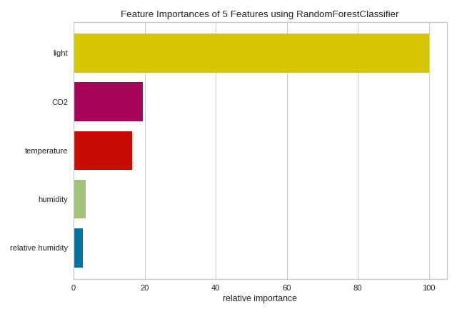
The above figure shows the features ranked according to the explained variance
each feature contributes to the model. In this case the features are plotted
against their relative importance, that is the percent importance of the
most important feature. The visualizer also contains features_ and
feature_importances_ attributes to get the ranked numeric values.
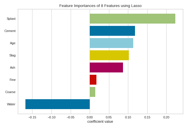
For models that do not support a feature_importances_ attribute, the
FeatureImportances visualizer will also draw a bar plot for the coef_
attribute that many linear models provide.
When using a model with a coef_ attribute, it is better to set
relative=False to draw the true magnitude of the coefficient (which may
be negative). We can also specify our own set of labels if the dataset does
not have column names or to print better titles. In the example below we
title case our features for better readability:
from sklearn.linear_model import Lasso
from yellowbrick.datasets import load_concrete
from yellowbrick.model_selection import FeatureImportances

# Load the regression dataset
dataset = load_concrete(return_dataset=True)
X, y = dataset.to_data()

# Title case the feature for better display and create the visualizer
labels = list(map(lambda s: s.title(), dataset.meta['features']))
viz = FeatureImportances(Lasso(), labels=labels, relative=False)

# Fit and show the feature importances
viz.fit(X, y)
viz.show()
(Source code, png, pdf)

Note
The interpretation of the importance of coeficients depends on the model; see the discussion below for more details.
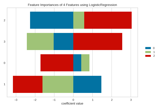
Stacked Feature Importances
Some estimators return a multi-dimensonal array for either feature_importances_ or coef_ attributes. For example the LogisticRegression classifier returns a coef_ array in the shape of (n_classes, n_features) in the multiclass case. These coefficients map the importance of the feature to the prediction of the probability of a specific class. Although the interpretation of multi-dimensional feature importances depends on the specific estimator and model family, the data is treated the same in the FeatureImportances visualizer – namely the importances are averaged.
Taking the mean of the importances may be undesirable for several reasons. For example, a feature may be more informative for some classes than others. Multi-output estimators also do not benefit from having averages taken across what are essentially multiple internal models. In this case, use the stack=True parameter to draw a stacked bar chart of importances as follows:
from yellowbrick.model_selection import FeatureImportances
from sklearn.linear_model import LogisticRegression
from sklearn.datasets import load_iris

data = load_iris()
X, y = data.data, data.target

model = LogisticRegression(multi_class="auto", solver="liblinear")
viz = FeatureImportances(model, stack=True, relative=False)
viz.fit(X, y)
viz.show()
(Source code, png, pdf)
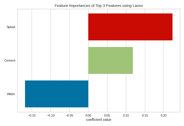
Top and Bottom Feature Importances
It may be more illuminating to the feature engineering process to identify the most or least informative features. To view only the N most informative features, specify the topn argument to the visualizer. Similar to slicing a ranked list by their importance, if topn is a postive integer, then the most highly ranked features are used. If topn is a negative integer, then the lowest ranked features are displayed instead.
from sklearn.linear_model import Lasso
from yellowbrick.datasets import load_concrete
from yellowbrick.model_selection import FeatureImportances

# Load the regression dataset
dataset = load_concrete(return_dataset=True)
X, y = dataset.to_data()

# Title case the feature for better display and create the visualizer
labels = list(map(lambda s: s.title(), dataset.meta['features']))
viz = FeatureImportances(Lasso(), labels=labels, relative=False, topn=3)

# Fit and show the feature importances
viz.fit(X, y)
viz.show()
(Source code, png, pdf)

Using topn=3, we can identify the three most informative features in the concrete dataset as splast, cement, and water. This approach to visualization may assist with factor analysis - the study of how variables contribute to an overall model. Note that although water has a negative coefficient, it is the magnitude (absolute value) of the feature that matters since we are closely inspecting the negative correlation of water with the strength of concrete. Alternatively, topn=-3 would reveal the three least informative features in the model. This approach is useful to model tuning similar to Recursive Feature Elimination, but instead of automatically removing features, it would allow you to identify the lowest-ranked features as they change in different model instantiations. In either case, if you have many features, using topn can significantly increase the visual and analytical capacity of your analysis.
The topn parameter can also be used when stacked=True. In the context of stacked feature importance graphs, the information of a feature is the width of the entire bar, or the sum of the absolute value of all coefficients contained therein.
from yellowbrick.model_selection import FeatureImportances
from sklearn.linear_model import LogisticRegression
from sklearn.datasets import load_iris

data = load_iris()
X, y = data.data, data.target

model = LogisticRegression(multi_class="auto", solver="liblinear")
viz = FeatureImportances(model, stack=True, relative=False, topn=-3)
viz.fit(X, y)
viz.show()
(Source code, png, pdf)
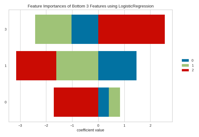

Discussion
Generalized linear models compute a predicted independent variable via the linear combination of an array of coefficients with an array of dependent variables. GLMs are fit by modifying the coefficients so as to minimize error and regularization techniques specify how the model modifies coefficients in relation to each other. As a result, an opportunity presents itself: larger coefficients are necessarily “more informative” because they contribute a greater weight to the final prediction in most cases.
Additionally we may say that instance features may also be more or less “informative” depending on the product of the instance feature value with the feature coefficient. This creates two possibilities:
We can compare models based on ranking of coefficients, such that a higher coefficient is “more informative”.
We can compare instances based on ranking of feature/coefficient products such that a higher product is “more informative”.
In both cases, because the coefficient may be negative (indicating a strong negative correlation) we must rank features by the absolute values of their coefficients. Visualizing a model or multiple models by most informative feature is usually done via bar chart where the y-axis is the feature names and the x-axis is numeric value of the coefficient such that the x-axis has both a positive and negative quadrant. The bigger the size of the bar, the more informative that feature is.
This method may also be used for instances; but generally there are very many instances relative to the number models being compared. Instead a heatmap grid is a better choice to inspect the influence of features on individual instances. Here the grid is constructed such that the x-axis represents individual features, and the y-axis represents individual instances. The color of each cell (an instance, feature pair) represents the magnitude of the product of the instance value with the feature’s coefficient for a single model. Visual inspection of this diagnostic may reveal a set of instances for which one feature is more predictive than another; or other types of regions of information in the model itself.
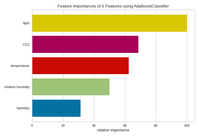
Quick Method
The same functionality above can be achieved with the associated quick method feature_importances. This method will build the FeatureImportances object with the associated arguments, fit it, then (optionally) immediately show it.
from sklearn.ensemble import AdaBoostClassifier
from yellowbrick.datasets import load_occupancy
from yellowbrick.model_selection import feature_importances

# Load dataset
X, y = load_occupancy()

# Use the quick method and immediately show the figure
feature_importances(AdaBoostClassifier(), X, y)
(Source code, png, pdf)
API Reference
Implementation of a feature importances visualizer. This visualizer sits in kind of a weird place since it is technically a model scoring visualizer, but is generally used for feature engineering.
- class yellowbrick.model_selection.importances.FeatureImportances(estimator, ax=None, labels=None, relative=True, absolute=False, xlabel=None, stack=False, colors=None, colormap=None, is_fitted='auto', topn=None, **kwargs)[source]
Bases:
ModelVisualizerDisplays the most informative features in a model by showing a bar chart of features ranked by their importances. Although primarily a feature engineering mechanism, this visualizer requires a model that has either a
coef_orfeature_importances_parameter after fit.Note: Some classification models such as
LogisticRegression, returncoef_as a multidimensional array of shape(n_classes, n_features). In this case, theFeatureImportancesvisualizer computes the mean of thecoefs_by class for each feature.- Parameters
- estimatorEstimator
A Scikit-Learn estimator that learns feature importances. Must support either
coef_orfeature_importances_parameters. If the estimator is not fitted, it is fit when the visualizer is fitted, unless otherwise specified byis_fitted.- axmatplotlib Axes, default: None
The axis to plot the figure on. If None is passed in the current axes will be used (or generated if required).
- labelslist, default: None
A list of feature names to use. If a DataFrame is passed to fit and features is None, feature names are selected as the column names.
- relativebool, default: True
If true, the features are described by their relative importance as a percentage of the strongest feature component; otherwise the raw numeric description of the feature importance is shown.
- absolutebool, default: False
Make all coeficients absolute to more easily compare negative coefficients with positive ones.
- xlabelstr, default: None
The label for the X-axis. If None is automatically determined by the underlying model and options provided.
- stackbool, default: False
If true and the classifier returns multi-class feature importance, then a stacked bar plot is plotted; otherwise the mean of the feature importance across classes are plotted.
- colors: list of strings
Specify colors for each bar in the chart if
stack==False.- colormapstring or matplotlib cmap
Specify a colormap to color the classes if
stack==True.- is_fittedbool or str, default=’auto’
Specify if the wrapped estimator is already fitted. If False, the estimator will be fit when the visualizer is fit, otherwise, the estimator will not be modified. If ‘auto’ (default), a helper method will check if the estimator is fitted before fitting it again.
- topnint, default=None
Display only the top N results with a positive integer, or the bottom N results with a negative integer. If None or 0, all results are shown.
- kwargsdict
Keyword arguments that are passed to the base class and may influence the visualization as defined in other Visualizers.
Examples
>>> from sklearn.ensemble import GradientBoostingClassifier
>>> visualizer = FeatureImportances(GradientBoostingClassifier())
>>> visualizer.fit(X, y)
>>> visualizer.show()
- Attributes
- features_np.array
The feature labels ranked according to their importance
- feature_importances_np.array
The numeric value of the feature importance computed by the model
- classes_np.array
The classes labeled. Is not None only for classifier.
- fit(X, y=None, **kwargs)[source]
Fits the estimator to discover the feature importances described by the data, then draws those importances as a bar plot.
- Parameters
- Xndarray or DataFrame of shape n x m
A matrix of n instances with m features
- yndarray or Series of length n
An array or series of target or class values
- kwargsdict
Keyword arguments passed to the fit method of the estimator.
- Returns
- selfvisualizer
The fit method must always return self to support pipelines.
- yellowbrick.model_selection.importances.feature_importances(estimator, X, y=None, ax=None, labels=None, relative=True, absolute=False, xlabel=None, stack=False, colors=None, colormap=None, is_fitted='auto', topn=None, show=True, **kwargs)[source]
Quick Method: Displays the most informative features in a model by showing a bar chart of features ranked by their importances. Although primarily a feature engineering mechanism, this visualizer requires a model that has either a
coef_orfeature_importances_parameter after fit.- Parameters
- estimatorEstimator
A Scikit-Learn estimator that learns feature importances. Must support either
coef_orfeature_importances_parameters. If the estimator is not fitted, it is fit when the visualizer is fitted, unless otherwise specified byis_fitted.- Xndarray or DataFrame of shape n x m
A matrix of n instances with m features
- yndarray or Series of length n, optional
An array or series of target or class values
- axmatplotlib Axes, default: None
The axis to plot the figure on. If None is passed in the current axes will be used (or generated if required).
- labelslist, default: None
A list of feature names to use. If a DataFrame is passed to fit and features is None, feature names are selected as the column names.
- relativebool, default: True
If true, the features are described by their relative importance as a percentage of the strongest feature component; otherwise the raw numeric description of the feature importance is shown.
- absolutebool, default: False
Make all coeficients absolute to more easily compare negative coeficients with positive ones.
- xlabelstr, default: None
The label for the X-axis. If None is automatically determined by the underlying model and options provided.
- stackbool, default: False
If true and the classifier returns multi-class feature importance, then a stacked bar plot is plotted; otherwise the mean of the feature importance across classes are plotted.
- colors: list of strings
Specify colors for each bar in the chart if
stack==False.- colormapstring or matplotlib cmap
Specify a colormap to color the classes if
stack==True.- is_fittedbool or str, default=’auto’
Specify if the wrapped estimator is already fitted. If False, the estimator will be fit when the visualizer is fit, otherwise, the estimator will not be modified. If ‘auto’ (default), a helper method will check if the estimator is fitted before fitting it again.
- show: bool, default: True
If True, calls
show(), which in turn callsplt.show()however you cannot callplt.savefigfrom this signature, norclear_figure. If False, simply callsfinalize()- topnint, default=None
Display only the top N results with a positive integer, or the bottom N results with a negative integer. If None or 0, all results are shown.
- kwargsdict
Keyword arguments that are passed to the base class and may influence the visualization as defined in other Visualizers.
- Returns
- vizFeatureImportances
The feature importances visualizer, fitted and finalized.