Yellowbrick: Machine Learning Visualization
Yellowbrick extends the Scikit-Learn API to make model selection and hyperparameter tuning easier. Under the hood, it’s using Matplotlib.
Recommended Learning Path
Check out the Quick Start, try the Model Selection Tutorial, and check out the Oneliners.
Use Yellowbrick in your work, referencing the Visualizers and API for assistance with specific visualizers and detailed information on optional parameters and customization options.
Star us on GitHub and follow us on Twitter (@scikit_yb) so that you’ll hear about new visualizers as soon as they’re added.
Contributing
Interested in contributing to Yellowbrick? Yellowbrick is a welcoming, inclusive project and we would love to have you. We follow the Python Software Foundation Code of Conduct.
No matter your level of technical skill, you can be helpful. We appreciate bug reports, user testing, feature requests, bug fixes, product enhancements, and documentation improvements.
Check out the Contributing guide!
If you’ve signed up to do user testing, head over to the User Testing Instructions.
Please consider joining the Google Groups Listserv listserve so you can respond to questions.
Thank you for your contributions!
Concepts & API
Visualizers
The primary goal of Yellowbrick is to create a sensical API similar to Scikit-Learn.
Visualizers are the core objects in Yellowbrick. They are similar to transformers in Scikit-Learn. Visualizers can wrap a model estimator - similar to how the “ModelCV” (e.g. RidgeCV, LassoCV) methods work.
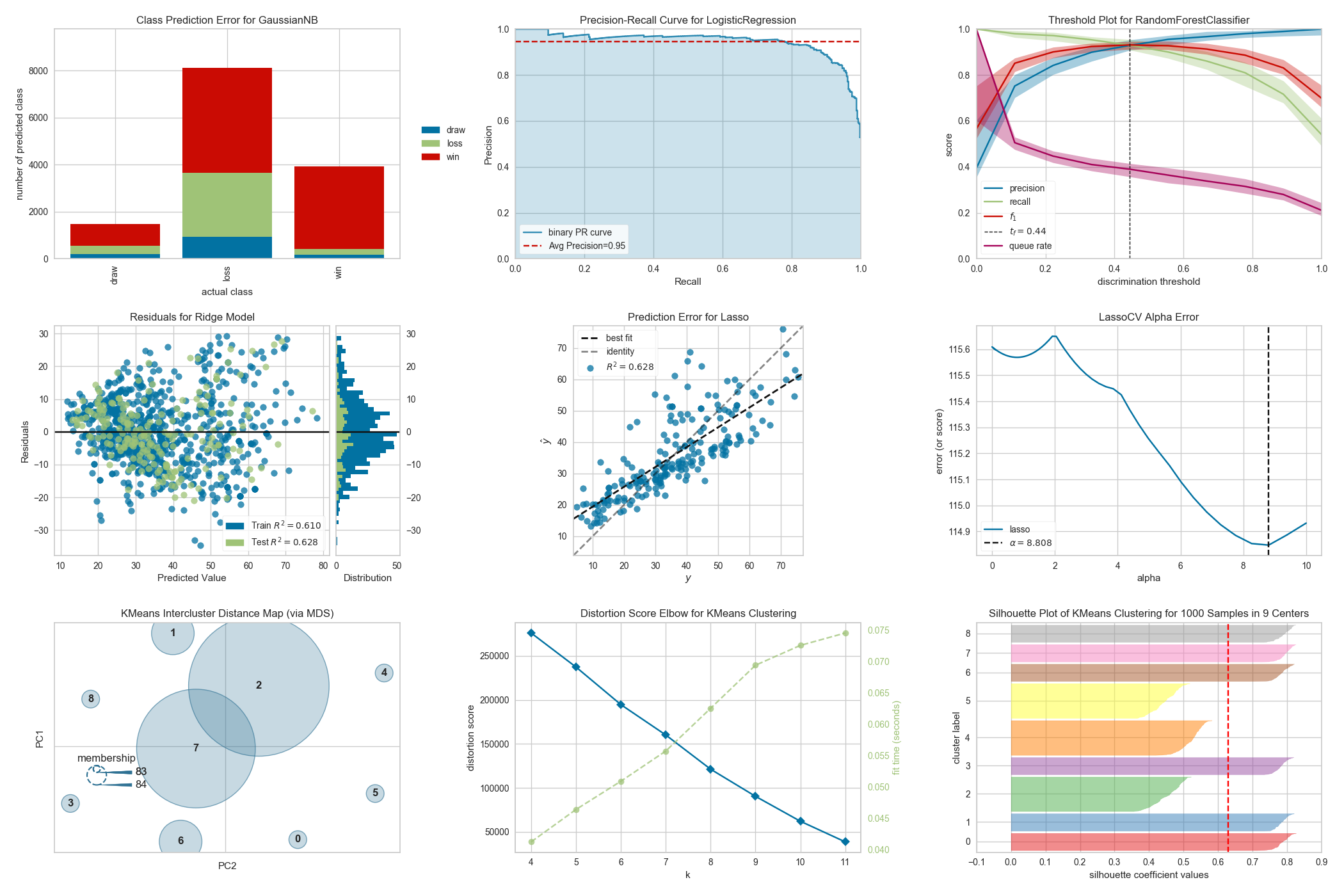
Some of our most popular visualizers include:
Feature Visualization
Rank Features: pairwise ranking of features to detect relationships
Parallel Coordinates: horizontal visualization of instances
Radial Visualization: separation of instances around a circular plot
PCA Projection: projection of instances based on principal components
Manifold Visualization: high dimensional visualization with manifold learning
Joint Plots: direct data visualization with feature selection
Classification Visualization
Class Prediction Error: shows error and support in classification
Classification Report: visual representation of precision, recall, and F1
ROC/AUC Curves: receiver operator characteristics and area under the curve
Precision-Recall Curves: precision vs recall for different probability thresholds
Confusion Matrices: visual description of class decision making
Discrimination Threshold: find a threshold that best separates binary classes
Regression Visualization
Prediction Error Plot: find model breakdowns along the domain of the target
Residuals Plot: show the difference in residuals of training and test data
Alpha Selection: show how the choice of alpha influences regularization
Cook’s Distance: show the influence of instances on linear regression
Clustering Visualization
K-Elbow Plot: select k using the elbow method and various metrics
Silhouette Plot: select k by visualizing silhouette coefficient values
Intercluster Distance Maps: show relative distance and size/importance of clusters
Model Selection Visualization
Validation Curve: tune a model with respect to a single hyperparameter
Learning Curve: show if a model might benefit from more data or less complexity
Feature Importances: rank features by importance or linear coefficients for a specific model
Recursive Feature Elimination: find the best subset of features based on importance
Target Visualization
Balanced Binning Reference: generate a histogram with vertical lines showing the recommended value point to bin the data into evenly distributed bins
Class Balance: see how the distribution of classes affects the model
Feature Correlation: display the correlation between features and dependent variables
Text Visualization
Term Frequency: visualize the frequency distribution of terms in the corpus
t-SNE Corpus Visualization: use stochastic neighbor embedding to project documents
Dispersion Plot: visualize how key terms are dispersed throughout a corpus
UMAP Corpus Visualization: plot similar documents closer together to discover clusters
PosTag Visualization: plot the counts of different parts-of-speech throughout a tagged corpus
… and more! Visualizers are being added all the time. Check the examples (or even the develop branch). Feel free to contribute your ideas for new Visualizers!
Getting Help
Can’t get someting to work? Here are places you can find help.
The docs (you’re here!).
Stack Overflow. If you ask a question, please tag it with “yellowbrick”.
The Yellowbrick Google Groups Listserv.
You can also Tweet or direct message us on Twitter @scikit_yb.
Find a Bug?
Check if there’s already an open issue on the topic. If needed, file an issue.
Open Source
The Yellowbrick license is an open source Apache 2.0 license. Yellowbrick enjoys a very active developer community; please consider Contributing!
Yellowbrick is hosted on GitHub. The issues and pull requests are tracked there.
Table of Contents
- Quick Start
- Model Selection Tutorial
- Visualizers and API
- Oneliners
- Contributing
- Effective Matplotlib
- Yellowbrick for Teachers
- Gallery
- About
- Frequently Asked Questions
- How can I change the size of a Yellowbrick plot?
- How can I change the title of a Yellowbrick plot?
- How can I change the color of a Yellowbrick plot?
- How can I save a Yellowbrick plot?
- How can I make overlapping points show up better?
- How can I access the sample datasets used in the examples?
- Can I use Yellowbrick with libraries other than scikit-learn?
- User Testing Instructions
- Code of Conduct
- Changelog
- Version 1.5
- Version 1.4
- Version 1.3.post1
- Version 1.3
- Hotfix 1.2.1
- Version 1.2
- Version 1.1
- Hotfix 1.0.1
- Version 1.0
- Hotfix 0.9.1
- Version 0.9
- Version 0.8
- Version 0.7
- Version 0.6
- Version 0.5
- Hotfix 0.4.2
- Version 0.4.1
- Version 0.4
- Version 0.3.3
- Version 0.3.2
- Hotfix 0.3.1
- Version 0.3
- Version 0.2
- Version 0.1
- Governance