Class Balance
One of the biggest challenges for classification models is an imbalance of classes in the training data. Severe class imbalances may be masked by relatively good F1 and accuracy scores – the classifier is simply guessing the majority class and not making any evaluation on the underrepresented class.
There are several techniques for dealing with class imbalance such as stratified sampling, down sampling the majority class, weighting, etc. But before these actions can be taken, it is important to understand what the class balance is in the training data. The ClassBalance visualizer supports this by creating a bar chart of the support for each class, that is the frequency of the classes’ representation in the dataset.
Visualizer |
|
Quick Method |
|
Models |
Classification |
Workflow |
Feature analysis, Target analysis, Model selection |
from yellowbrick.datasets import load_game
from yellowbrick.target import ClassBalance

# Load the classification dataset
X, y = load_game()

# Instantiate the visualizer
visualizer = ClassBalance(labels=["draw", "loss", "win"])

visualizer.fit(y)        # Fit the data to the visualizer
visualizer.show()        # Finalize and render the figure
(Source code, png, pdf)
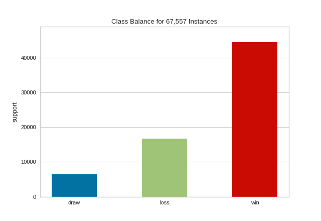
The resulting figure allows us to diagnose the severity of the balance issue. In this figure we can see that the "win" class dominates the other two classes. One potential solution might be to create a binary classifier: "win" vs "not win" and combining the "loss" and "draw" classes into one class.
Warning
The ClassBalance visualizer interface has changed in version 0.9, a classification model is no longer required to instantiate the visualizer, it can operate on data only. Additionally, the signature of the fit method has changed from fit(X, y=None) to fit(y_train, y_test=None), passing in X is no longer required.
If a class imbalance must be maintained during evaluation (e.g. the event being classified is actually as rare as the frequency implies) then stratified sampling should be used to create train and test splits. This ensures that the test data has roughly the same proportion of classes as the training data. While scikit-learn does this by default in train_test_split and other cv methods, it can be useful to compare the support of each class in both splits.
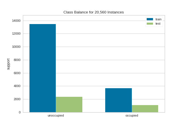
The ClassBalance visualizer has a “compare” mode, where the train and test data can be passed to fit(), creating a side-by-side bar chart instead of a single bar chart as follows:
from sklearn.model_selection import TimeSeriesSplit

from yellowbrick.datasets import load_occupancy
from yellowbrick.target import ClassBalance

# Load the classification dataset
X, y = load_occupancy()

# Create the training and test data
tscv = TimeSeriesSplit()
for train_index, test_index in tscv.split(X):
    X_train, X_test = X.iloc[train_index], X.iloc[test_index]
    y_train, y_test = y.iloc[train_index], y.iloc[test_index]

# Instantiate the visualizer
visualizer = ClassBalance(labels=["unoccupied", "occupied"])

visualizer.fit(y_train, y_test)        # Fit the data to the visualizer
visualizer.show()                      # Finalize and render the figure
(Source code, png, pdf)

This visualization allows us to do a quick check to ensure that the proportion of each class is roughly similar in both splits. This visualization should be a first stop particularly when evaluation metrics are highly variable across different splits.
Note
This example uses TimeSeriesSplit to split the data into the training and test sets. For more information on this cross-validation method, please refer to the scikit-learn documentation.
Quick Method
The same functionalities above can be achieved with the associated quick method class_balance. This method will build the ClassBalance object with the associated arguments, fit it, then (optionally) immediately show it.
from yellowbrick.datasets import load_game
from yellowbrick.target import class_balance

# Load the dataset
X, y = load_game()

# Use the quick method and immediately show the figure
class_balance(y)
(Source code, png, pdf)

API Reference
Class balance visualizer for showing per-class support.
- class yellowbrick.target.class_balance.ClassBalance(ax=None, labels=None, colors=None, colormap=None, **kwargs)[source]
Bases:
TargetVisualizerOne of the biggest challenges for classification models is an imbalance of classes in the training data. The ClassBalance visualizer shows the relationship of the support for each class in both the training and test data by displaying how frequently each class occurs as a bar graph.
The ClassBalance visualizer can be displayed in two modes:
Balance mode: show the frequency of each class in the dataset.
Compare mode: show the relationship of support in train and test data.
These modes are determined by what is passed to the
fit()method.- Parameters
- axmatplotlib Axes, default: None
The axis to plot the figure on. If None is passed in the current axes will be used (or generated if required).
- labels: list, optional
A list of class names for the x-axis if the target is already encoded. Ensure that the labels are ordered lexicographically with respect to the values in the target. A common use case is to pass
LabelEncoder.classes_as this parameter. If not specified, the labels in the data will be used.- colors: list of strings
Specify colors for the barchart (will override colormap if both are provided).
- colormapstring or matplotlib cmap
Specify a colormap to color the classes.
- kwargs: dict, optional
Keyword arguments passed to the super class. Here, used to colorize the bars in the histogram.
Examples
To simply observe the balance of classes in the target:
>>> viz = ClassBalance().fit(y)
>>> viz.show()
To compare the relationship between training and test data:
>>> _, _, y_train, y_test = train_test_split(X, y, test_size=0.2)
>>> viz = ClassBalance()
>>> viz.fit(y_train, y_test)
>>> viz.show()
- Attributes
- classes_array-like
The actual unique classes discovered in the target.
- support_array of shape (n_classes,) or (2, n_classes)
A table representing the support of each class in the target. It is a vector when in balance mode, or a table with two rows in compare mode.
- finalize(**kwargs)[source]
Finalizes the figure for drawing by setting a title, the legend, and axis labels, removing the grid, and making sure the figure is correctly zoomed into the bar chart.
- Parameters
- kwargs: generic keyword arguments.
Notes
Generally this method is called from show and not directly by the user.
- fit(y_train, y_test=None)[source]
Fit the visualizer to the the target variables, which must be 1D vectors containing discrete (classification) data. Fit has two modes:
Balance mode: if only y_train is specified
Compare mode: if both train and test are specified
In balance mode, the bar chart is displayed with each class as its own color. In compare mode, a side-by-side bar chart is displayed colored by train or test respectively.
- Parameters
- y_trainarray-like
Array or list of shape (n,) that contains discrete data.
- y_testarray-like, optional
Array or list of shape (m,) that contains discrete data. If specified, the bar chart will be drawn in compare mode.
- yellowbrick.target.class_balance.class_balance(y_train, y_test=None, ax=None, labels=None, color=None, colormap=None, show=True, **kwargs)[source]
Quick method:
One of the biggest challenges for classification models is an imbalance of classes in the training data. This function vizualizes the relationship of the support for each class in both the training and test data by displaying how frequently each class occurs as a bar graph.
The figure can be displayed in two modes:
Balance mode: show the frequency of each class in the dataset.
Compare mode: show the relationship of support in train and test data.
Balance mode is the default if only y_train is specified. Compare mode happens when both y_train and y_test are specified.
- Parameters
- y_trainarray-like
Array or list of shape (n,) that containes discrete data.
- y_testarray-like, optional
Array or list of shape (m,) that contains discrete data. If specified, the bar chart will be drawn in compare mode.
- axmatplotlib Axes, default: None
The axis to plot the figure on. If None is passed in the current axes will be used (or generated if required).
- labels: list, optional
A list of class names for the x-axis if the target is already encoded. Ensure that the labels are ordered lexicographically with respect to the values in the target. A common use case is to pass
LabelEncoder.classes_as this parameter. If not specified, the labels in the data will be used.- colors: list of strings
Specify colors for the barchart (will override colormap if both are provided).
- colormapstring or matplotlib cmap
Specify a colormap to color the classes.
- showbool, default: True
If True, calls
show(), which in turn callsplt.show()however you cannot callplt.savefigfrom this signature, norclear_figure. If False, simply callsfinalize()- kwargs: dict, optional
Keyword arguments passed to the super class. Here, used to colorize the bars in the histogram.
- Returns
- visualizerClassBalance
Returns the fitted visualizer