ROCAUC
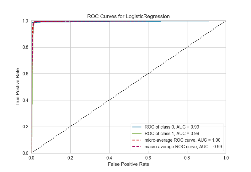
A ROCAUC (Receiver Operating Characteristic/Area Under the Curve) plot allows the user to visualize the tradeoff between the classifier's sensitivity and specificity.
# Load the classification data set
data = load_data('occupancy')

# Specify the features of interest and the classes of the target
features = ["temperature", "relative humidity", "light", "C02", "humidity"]
classes = ['unoccupied', 'occupied']

# Extract the numpy arrays from the data frame
X = data[features].as_matrix()
y = data.occupancy.as_matrix()

# Create the train and test data
X_train, X_test, y_train, y_test = train_test_split(X, y, test_size=0.2)
# Instantiate the classification model and visualizer
logistic = LogisticRegression()
visualizer = ROCAUC(logistic)

visualizer.fit(X_train, y_train)  # Fit the training data to the visualizer
visualizer.score(X_test, y_test)  # Evaluate the model on the test data
g = visualizer.poof()             # Draw/show/poof the data
API Reference
Implements visual ROC/AUC curves for classification evaluation.
-
class
yellowbrick.classifier.rocauc.ROCAUC(model, ax=None, classes=None, micro=True, macro=True, per_class=True, **kwargs)[源代码]¶ 基类:
yellowbrick.classifier.base.ClassificationScoreVisualizerReceiver Operating Characteristic (ROC) curves are a measure of a classifier's predictive quality that compares and visualizes the tradeoff between the models' sensitivity and specificity. The ROC curve displays the true positive rate on the Y axis and the false positive rate on the X axis on both a global average and per-class basis. The ideal point is therefore the top-left corner of the plot: false positives are zero and true positives are one.
This leads to another metric, area under the curve (AUC), a computation of the relationship between false positives and true positives. The higher the AUC, the better the model generally is. However, it is also important to inspect the "steepness" of the curve, as this describes the maximization of the true positive rate while minimizing the false positive rate. Generalizing "steepness" usually leads to discussions about convexity, which we do not get into here.
Parameters: - ax : the axis to plot the figure on.
- model : the Scikit-Learn estimator
Should be an instance of a classifier, else the __init__ will return an error.
- classes : list
A list of class names for the legend. If classes is None and a y value is passed to fit then the classes are selected from the target vector. Note that the curves must be computed based on what is in the target vector passed to the
score()method. Class names are used for labeling only and must be in the correct order to prevent confusion.- micro : bool, default = True
Plot the micro-averages ROC curve, computed from the sum of all true positives and false positives across all classes.
- macro : bool, default = True
Plot the macro-averages ROC curve, which simply takes the average of curves across all classes.
- per_class : bool, default = True
Plot the ROC curves for each individual class. Primarily this is set to false if only the macro or micro average curves are required.
- kwargs : keyword arguments passed to the super class.
Currently passing in hard-coded colors for the Receiver Operating Characteristic curve and the diagonal. These will be refactored to a default Yellowbrick style.
Notes
ROC curves are typically used in binary classification, and in fact the Scikit-Learn
roc_curvemetric is only able to perform metrics for binary classifiers. As a result it is necessary to binarize the output or to use one-vs-rest or one-vs-all strategies of classification. The visualizer does its best to handle multiple situations, but exceptions can arise from unexpected models or outputs.Another important point is the relationship of class labels specified on initialization to those drawn on the curves. The classes are not used to constrain ordering or filter curves; the ROC computation happens on the unique values specified in the target vector to the
scoremethod. To ensure the best quality visualization, do not use a LabelEncoder for this and do not pass in class labels.Examples
>>> from sklearn.datasets import load_breast_cancer
>>> from yellowbrick.classifier import ROCAUC
>>> from sklearn.linear_model import LogisticRegression
>>> from sklearn.model_selection import train_test_split
>>> data = load_breast_cancer()
>>> X = data['data']
>>> y = data['target']
>>> X_train, X_test, y_train, y_test = train_test_split(X, y)
>>> viz = ROCAUC(LogisticRegression())
>>> viz.fit(X_train, y_train)
>>> viz.score(X_test, y_test)
>>> viz.poof()
-
draw()[源代码]¶ Renders ROC-AUC plot. Called internally by score, possibly more than once
Returns: - ax : the axis with the plotted figure
-
finalize(**kwargs)[源代码]¶ Finalize executes any subclass-specific axes finalization steps. The user calls poof and poof calls finalize.
Parameters: - kwargs: generic keyword arguments.
-
score(X, y=None, **kwargs)[源代码]¶ Generates the predicted target values using the Scikit-Learn estimator.
Parameters: - X : ndarray or DataFrame of shape n x m
A matrix of n instances with m features
- y : ndarray or Series of length n
An array or series of target or class values
Returns: - score : float
The micro-average area under the curve of all classes.