Feature Importances
The feature engineering process involves selecting the minimum required features to produce a valid model because the more features a model contains, the more complex it is (and the more sparse the data), therefore the more sensitive the model is to errors due to variance. A common approach to eliminating features is to describe their relative importance to a model, then eliminate weak features or combinations of features and re-evalute to see if the model fairs better during cross-validation.
Many model forms describe the underlying impact of features relative to each
other. In Scikit-Learn, Decision Tree models and ensembles of trees such as
Random Forest, Gradient Boosting, and Ada Boost provide a
feature_importances_ attribute when fitted. The Yellowbrick
FeatureImportances visualizer utilizes this attribute to rank and plot
relative importances. Let's start with an example; first load a
classification dataset as follows:
# Load the classification data set
data = load_data('occupancy')

# Specify the features of interest
features = [
    "temperature", "relative humidity", "light", "C02", "humidity"
]

# Extract the instances and target
X = data[features]
y = data.occupancy
Once the dataset has been loaded, we can create a new figure (this is
optional, if an Axes isn't specified, Yellowbrick will use the current
figure or create one). We can then fit a FeatureImportances visualizer
with a GradientBoostingClassifier to visualize the ranked features:
from sklearn.ensemble import GradientBoostingClassifier
from yellowbrick.features import FeatureImportances

# Create a new matplotlib figure
fig = plt.figure()
ax = fig.add_subplot()

viz = FeatureImportances(GradientBoostingClassifier(), ax=ax)
viz.fit(X, y)
viz.poof()
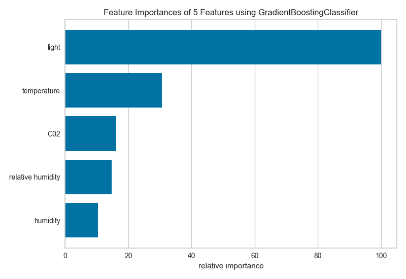
The above figure shows the features ranked according to the explained variance
each feature contributes to the model. In this case the features are plotted
against their relative importance, that is the percent importance of the
most important feature. The visualizer also contains features_ and
feature_importances_ attributes to get the ranked numeric values.
For models that do not support a feature_importances_ attribute, the
FeatureImportances visualizer will also draw a bar plot for the coef_
attribute that many linear models provide. First we start by loading a
regression dataset:
# Load a regression data set
data = load_data("concrete")

# Specify the features of interest
features = [
    'cement','slag','ash','water','splast','coarse','fine','age'
]

# Extract the instances and target
X = concrete[feats]
y = concrete.strength
When using a model with a coef_ attribute, it is better to set
relative=False to draw the true magnitude of the coefficient (which may
be negative). We can also specify our own set of labels if the dataset does
not have column names or to print better titles. In the example below we
title case our features for better readability:
# Create a new figure
fig = plt.figure()
ax = fig.add_subplot()

# Title case the feature for better display and create the visualizer
labels = list(map(lambda s: s.title(), features))
viz = FeatureImportances(Lasso(), ax=ax, labels=labels, relative=False)

# Fit and show the feature importances
viz.fit(X, y)
viz.poof()
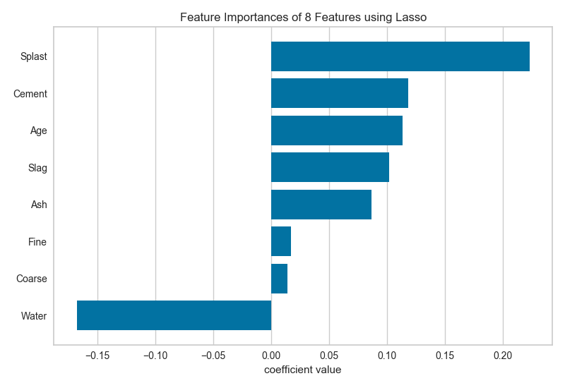
注解
The interpretation of the importance of coeficients depends on the model; see the discussion below for more details.
Discussion
Generalized linear models compute a predicted independent variable via the linear combination of an array of coefficients with an array of dependent variables. GLMs are fit by modifying the coefficients so as to minimize error and regularization techniques specify how the model modifies coefficients in relation to each other. As a result, an opportunity presents itself: larger coefficients are necessarily "more informative" because they contribute a greater weight to the final prediction in most cases.
Additionally we may say that instance features may also be more or less "informative" depending on the product of the instance feature value with the feature coefficient. This creates two possibilities:
- We can compare models based on ranking of coefficients, such that a higher coefficient is "more informative".
- We can compare instances based on ranking of feature/coefficient products such that a higher product is "more informative".
In both cases, because the coefficient may be negative (indicating a strong negative correlation) we must rank features by the absolute values of their coefficients. Visualizing a model or multiple models by most informative feature is usually done via bar chart where the y-axis is the feature names and the x-axis is numeric value of the coefficient such that the x-axis has both a positive and negative quadrant. The bigger the size of the bar, the more informative that feature is.
This method may also be used for instances; but generally there are very many instances relative to the number models being compared. Instead a heatmap grid is a better choice to inspect the influence of features on individual instances. Here the grid is constructed such that the x-axis represents individual features, and the y-axis represents individual instances. The color of each cell (an instance, feature pair) represents the magnitude of the product of the instance value with the feature's coefficient for a single model. Visual inspection of this diagnostic may reveal a set of instances for which one feature is more predictive than another; or other types of regions of information in the model itself.
API Reference
Implementation of a feature importances visualizer. This visualizer sits in kind of a weird place since it is technically a model scoring visualizer, but is generally used for feature engineering.
-
class
yellowbrick.features.importances.FeatureImportances(model, ax=None, labels=None, relative=True, absolute=False, xlabel=None, **kwargs)[源代码]¶ 基类:
yellowbrick.base.ModelVisualizerDisplays the most informative features in a model by showing a bar chart of features ranked by their importances. Although primarily a feature engineering mechanism, this visualizer requires a model that has either a
coef_orfeature_importances_parameter after fit.Parameters: - model : Estimator
A Scikit-Learn estimator that learns feature importances. Must support either
coef_orfeature_importances_parameters.- ax : matplotlib Axes, default: None
The axis to plot the figure on. If None is passed in the current axes will be used (or generated if required).
- labels : list, default: None
A list of feature names to use. If a DataFrame is passed to fit and features is None, feature names are selected as the column names.
- relative : bool, default: True
If true, the features are described by their relative importance as a percentage of the strongest feature component; otherwise the raw numeric description of the feature importance is shown.
- absolute : bool, default: False
Make all coeficients absolute to more easily compare negative coeficients with positive ones.
- xlabel : str, default: None
The label for the X-axis. If None is automatically determined by the underlying model and options provided.
- kwargs : dict
Keyword arguments that are passed to the base class and may influence the visualization as defined in other Visualizers.
Examples
>>> from sklearn.ensemble import GradientBoostingClassifier
>>> visualizer = FeatureImportances(GradientBoostingClassifier())
>>> visualizer.fit(X, y)
>>> visualizer.poof()
Attributes: - features_ : np.array
The feature labels ranked according to their importance
- feature_importances_ : np.array
The numeric value of the feature importance computed by the model
-
fit(X, y=None, **kwargs)[源代码]¶ Fits the estimator to discover the feature importances described by the data, then draws those importances as a bar plot.
Parameters: - X : ndarray or DataFrame of shape n x m
A matrix of n instances with m features
- y : ndarray or Series of length n
An array or series of target or class values
- kwargs : dict
Keyword arguments passed to the fit method of the estimator.
Returns: - self : visualizer
The fit method must always return self to support pipelines.