Parallel Coordinates
Parallel coordinates displays each feature as a vertical axis spaced evenly along the horizontal, and each instance as a line drawn between each individual axis. This allows many dimensions; in fact given infinite horizontal space (e.g. a scrollbar), an infinite number of dimensions can be displayed!
Data scientists use this method to detect clusters of instances that have similar classes, and to note features that have high variance or different distributions.
# Load the classification data set
data = load_data('occupancy')

# Specify the features of interest and the classes of the target
features = ["temperature", "relative humidity", "light", "C02", "humidity"]
classes = ['unoccupied', 'occupied']

# Extract the numpy arrays from the data frame
X = data[features].as_matrix()
y = data.occupancy.as_matrix()
# Instantiate the visualizer
visualizer = ParallelCoordinates(classes=classes, features=features)

visualizer.fit(X, y)      # Fit the data to the visualizer
visualizer.transform(X)   # Transform the data
visualizer.poof()         # Draw/show/poof the data
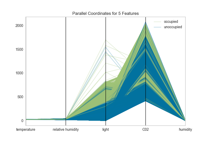
Parallel coordinates can take a long time to draw since each instance is represented by a line for each feature. Worse, this time is not well spent since a lot of overlap in the visualization makes the parallel coordinates less understandable. To fix this, pass the sample keyword argument to the visualizer with a percentage to randomly sample from the dataset.
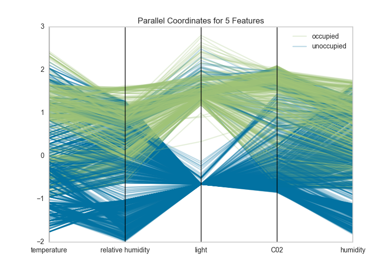
Additionally the domain of each feature may make the visualization hard to interpret. In the above visualization, the domain of the light feature is from in [0, 1600], far larger than the range of temperature in [50, 96]. A normalization methodology can be applied to change the range of features to [0,1]. Try using minmax, minabs, standard, l1, or l2 normalization to change perspectives in the parallel coordinates:
# Instantiate the visualizer
visualizer = ParallelCoordinates(
    classes=classes, features=features,
    normalize='standard', sample=0.1,
)

visualizer.fit(X, y)      # Fit the data to the visualizer
visualizer.transform(X)   # Transform the data
visualizer.poof()         # Draw/show/poof the data
API Reference
Implementations of parallel coordinates for multi-dimensional feature analysis. There are a variety of parallel coordinates from Andrews Curves to coordinates that optimize column order.
-
class
yellowbrick.features.pcoords.ParallelCoordinates(ax=None, features=None, classes=None, normalize=None, sample=1.0, color=None, colormap=None, vlines=True, vlines_kwds=None, **kwargs)[源代码]¶ 基类:
yellowbrick.features.base.DataVisualizerParallel coordinates displays each feature as a vertical axis spaced evenly along the horizontal, and each instance as a line drawn between each individual axis.
Parameters: - ax : matplotlib Axes, default: None
The axis to plot the figure on. If None is passed in the current axes will be used (or generated if required).
- features : list, default: None
a list of feature names to use If a DataFrame is passed to fit and features is None, feature names are selected as the columns of the DataFrame.
- classes : list, default: None
a list of class names for the legend If classes is None and a y value is passed to fit then the classes are selected from the target vector.
- normalize : string or None, default: None
specifies which normalization method to use, if any Current supported options are 'minmax', 'maxabs', 'standard', 'l1', and 'l2'.
- sample : float or int, default: 1.0
specifies how many examples to display from the data If int, specifies the maximum number of samples to display. If float, specifies a fraction between 0 and 1 to display.
- color : list or tuple, default: None
optional list or tuple of colors to colorize lines Use either color to colorize the lines on a per class basis or colormap to color them on a continuous scale.
- colormap : string or cmap, default: None
optional string or matplotlib cmap to colorize lines Use either color to colorize the lines on a per class basis or colormap to color them on a continuous scale.
- vlines : boolean, default: True
flag to determine vertical line display
- vlines_kwds : dict, default: None
options to style or display the vertical lines, default: None
- kwargs : dict
Keyword arguments that are passed to the base class and may influence the visualization as defined in other Visualizers.
Notes
These parameters can be influenced later on in the visualization process, but can and should be set as early as possible.
Examples
>>> visualizer = ParallelCoordinates()
>>> visualizer.fit(X, y)
>>> visualizer.transform(X)
>>> visualizer.poof()
-
draw(X, y, **kwargs)[源代码]¶ Called from the fit method, this method creates the parallel coordinates canvas and draws each instance and vertical lines on it.
-
finalize(**kwargs)[源代码]¶ Finalize executes any subclass-specific axes finalization steps. The user calls poof and poof calls finalize.
Parameters: - kwargs: generic keyword arguments.
-
normalizers= {'l1': Normalizer(copy=True, norm='l1'), 'l2': Normalizer(copy=True, norm='l2'), 'maxabs': MaxAbsScaler(copy=True), 'minmax': MinMaxScaler(copy=True, feature_range=(0, 1)), 'standard': StandardScaler(copy=True, with_mean=True, with_std=True)}