Direct Data Visualization
Sometimes for feature analysis you simply need a scatter plot to determine the distribution of data. Machine learning operates on high dimensional data, so the number of dimensions has to be filtered. As a result these visualizations are typically used as the base for larger visualizers; however you can also use them to quickly plot data during ML analysis.
Joint Plot Visualization
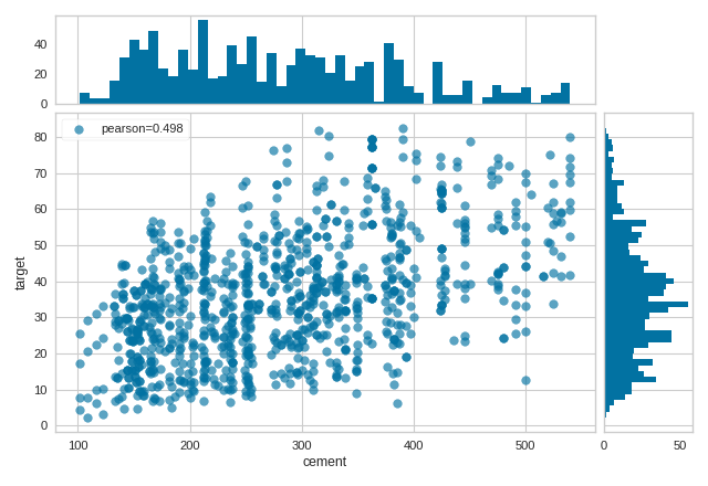
The JointPlotVisualizer plots a feature against the target and shows the distribution of each via a histogram on each axis.
Visualizer |
|
Quick Method |
|
Models |
Classification/Regression |
Workflow |
Feature Engineering/Selection |
from yellowbrick.datasets import load_concrete
from yellowbrick.features import JointPlotVisualizer

# Load the dataset
X, y = load_concrete()

# Instantiate the visualizer
visualizer = JointPlotVisualizer(columns="cement")

visualizer.fit_transform(X, y)        # Fit and transform the data
visualizer.show()                     # Finalize and render the figure
(Source code, png, pdf)

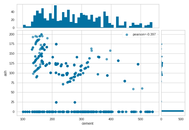
The JointPlotVisualizer can also be used to compare two features.
from yellowbrick.datasets import load_concrete
from yellowbrick.features import JointPlotVisualizer

# Load the dataset
X, y = load_concrete()

# Instantiate the visualizer
visualizer = JointPlotVisualizer(columns=["cement", "ash"])

visualizer.fit_transform(X, y)        # Fit and transform the data
visualizer.show()                     # Finalize and render the figure
(Source code, png, pdf)
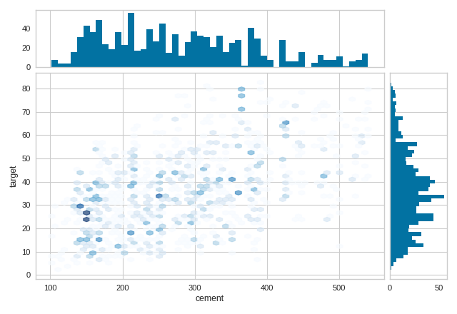
In addition, the JointPlotVisualizer can be plotted with hexbins in the case
of many, many points.
from yellowbrick.datasets import load_concrete
from yellowbrick.features import JointPlotVisualizer

# Load the dataset
X, y = load_concrete()

# Instantiate the visualizer
visualizer = JointPlotVisualizer(columns="cement", kind="hexbin")

visualizer.fit_transform(X, y)        # Fit and transform the data
visualizer.show()                     # Finalize and render the figure
(Source code, png, pdf)
Quick Method
The same functionality above can be achieved with the associated quick method joint_plot. This method
will build the JointPlot object with the associated arguments, fit it, then (optionally) immediately
show it.
from yellowbrick.datasets import load_concrete
from yellowbrick.features import joint_plot

# Load the dataset
X, y = load_concrete()

# Instantiate the visualizer
visualizer = joint_plot(X, y, columns="cement")
(Source code, png, pdf)

API Reference
- class yellowbrick.features.jointplot.JointPlot(ax=None, columns=None, correlation='pearson', kind='scatter', hist=True, alpha=0.65, joint_kws=None, hist_kws=None, **kwargs)[source]
Bases:
FeatureVisualizerJoint plots are useful for machine learning on multi-dimensional data, allowing for the visualization of complex interactions between different data dimensions, their varying distributions, and even their relationships to the target variable for prediction.
The Yellowbrick
JointPlotcan be used both for pairwise feature analysis and feature-to-target plots. For pairwise feature analysis, thecolumnsargument can be used to specify the index of the two desired columns inX. Ifyis also specified, the plot can be colored with a heatmap or by class. For feature-to-target plots, the user can provide eitherXandyas 1D vectors, or acolumnsargument with an index to a single feature inXto be plotted againsty.Histograms can be included by setting the
histargument toTruefor a frequency distribution, or to"density"for a probability density function. Note that histograms requires matplotlib 2.0.2 or greater.- Parameters
- axmatplotlib Axes, default: None
The axes to plot the figure on. If None is passed in the current axes will be used (or generated if required). This is considered the base axes where the the primary joint plot is drawn. It will be shifted and two additional axes added above (xhax) and to the right (yhax) if hist=True.
- columnsint, str, [int, int], [str, str], default: None
Determines what data is plotted in the joint plot and acts as a selection index into the data passed to
fit(X, y). This data therefore must be indexable by the column type (e.g. an int for a numpy array or a string for a DataFrame).If None is specified then either both X and y must be 1D vectors and they will be plotted against each other or X must be a 2D array with only 2 columns. If a single index is specified then the data is indexed as
X[columns]and plotted jointly with the target variable, y. If two indices are specified then they are both selected from X, additionally in this case, if y is specified, then it is used to plot the color of points.Note that these names are also used as the x and y axes labels if they aren’t specified in the joint_kws argument.
- correlationstr, default: ‘pearson’
The algorithm used to compute the relationship between the variables in the joint plot, one of: ‘pearson’, ‘covariance’, ‘spearman’, ‘kendalltau’.
- kindstr in {‘scatter’, ‘hex’}, default: ‘scatter’
The type of plot to render in the joint axes. Note that when kind=’hex’ the target cannot be plotted by color.
- hist{True, False, None, ‘density’, ‘frequency’}, default: True
Draw histograms showing the distribution of the variables plotted jointly. If set to ‘density’, the probability density function will be plotted. If set to True or ‘frequency’ then the frequency will be plotted. Requires Matplotlib >= 2.0.2.
- alphafloat, default: 0.65
Specify a transparency where 1 is completely opaque and 0 is completely transparent. This property makes densely clustered points more visible.
- {joint, hist}_kwsdict, default: None
Additional keyword arguments for the plot components.
- kwargsdict
Keyword arguments that are passed to the base class and may influence the visualization as defined in other Visualizers.
Examples
>>> viz = JointPlot(columns=["temp", "humidity"])
>>> viz.fit(X, y)
>>> viz.show()
- Attributes
- corr_float
The correlation or relationship of the data in the joint plot, specified by the correlation algorithm.
- correlation_methods = {'covariance': <function JointPlot.<lambda>>, 'kendalltau': <function JointPlot.<lambda>>, 'pearson': <function JointPlot.<lambda>>, 'spearman': <function JointPlot.<lambda>>}
- draw(x, y, xlabel=None, ylabel=None)[source]
Draw the joint plot for the data in x and y.
- Parameters
- x, y1D array-like
The data to plot for the x axis and the y axis
- xlabel, ylabelstr
The labels for the x and y axes.
- finalize(**kwargs)[source]
Finalize executes any remaining image modifications making it ready to show.
- fit(X, y=None)[source]
Fits the JointPlot, creating a correlative visualization between the columns specified during initialization and the data and target passed into fit:
If self.columns is None then X and y must both be specified as 1D arrays or X must be a 2D array with only 2 columns.
If self.columns is a single int or str, that column is selected to be visualized against the target y.
If self.columns is two ints or strs, those columns are visualized against each other. If y is specified then it is used to color the points.
This is the main entry point into the joint plot visualization.
- Parameters
- Xarray-like
An array-like object of either 1 or 2 dimensions depending on self.columns. Usually this is a 2D table with shape (n, m)
- yarray-like, default: None
An vector or 1D array that has the same length as X. May be used to either directly plot data or to color data points.
- property xhax
The axes of the histogram for the top of the JointPlot (X-axis)
- property yhax
The axes of the histogram for the right of the JointPlot (Y-axis)
- yellowbrick.features.jointplot.joint_plot(X, y, ax=None, columns=None, correlation='pearson', kind='scatter', hist=True, alpha=0.65, joint_kws=None, hist_kws=None, show=True, **kwargs)[source]
Joint plots are useful for machine learning on multi-dimensional data, allowing for the visualization of complex interactions between different data dimensions, their varying distributions, and even their relationships to the target variable for prediction.
The Yellowbrick
JointPlotcan be used both for pairwise feature analysis and feature-to-target plots. For pairwise feature analysis, thecolumnsargument can be used to specify the index of the two desired columns inX. Ifyis also specified, the plot can be colored with a heatmap or by class. For feature-to-target plots, the user can provide eitherXandyas 1D vectors, or acolumnsargument with an index to a single feature inXto be plotted againsty.Histograms can be included by setting the
histargument toTruefor a frequency distribution, or to"density"for a probability density function. Note that histograms requires matplotlib 2.0.2 or greater.- Parameters
- Xarray-like
An array-like object of either 1 or 2 dimensions depending on self.columns. Usually this is a 2D table with shape (n, m)
- yarray-like, default: None
An vector or 1D array that has the same length as X. May be used to either directly plot data or to color data points.
- axmatplotlib Axes, default: None
The axes to plot the figure on. If None is passed in the current axes will be used (or generated if required). This is considered the base axes where the the primary joint plot is drawn. It will be shifted and two additional axes added above (xhax) and to the right (yhax) if hist=True.
- columnsint, str, [int, int], [str, str], default: None
Determines what data is plotted in the joint plot and acts as a selection index into the data passed to
fit(X, y). This data therefore must be indexable by the column type (e.g. an int for a numpy array or a string for a DataFrame).If None is specified then either both X and y must be 1D vectors and they will be plotted against each other or X must be a 2D array with only 2 columns. If a single index is specified then the data is indexed as
X[columns]and plotted jointly with the target variable, y. If two indices are specified then they are both selected from X, additionally in this case, if y is specified, then it is used to plot the color of points.Note that these names are also used as the x and y axes labels if they aren’t specified in the joint_kws argument.
- correlationstr, default: ‘pearson’
The algorithm used to compute the relationship between the variables in the joint plot, one of: ‘pearson’, ‘covariance’, ‘spearman’, ‘kendalltau’.
- kindstr in {‘scatter’, ‘hex’}, default: ‘scatter’
The type of plot to render in the joint axes. Note that when kind=’hex’ the target cannot be plotted by color.
- hist{True, False, None, ‘density’, ‘frequency’}, default: True
Draw histograms showing the distribution of the variables plotted jointly. If set to ‘density’, the probability density function will be plotted. If set to True or ‘frequency’ then the frequency will be plotted. Requires Matplotlib >= 2.0.2.
- alphafloat, default: 0.65
Specify a transparency where 1 is completely opaque and 0 is completely transparent. This property makes densely clustered points more visible.
- {joint, hist}_kwsdict, default: None
Additional keyword arguments for the plot components.
- showbool, default: True
If True, calls
show(), which in turn callsplt.show()however you cannot callplt.savefigfrom this signature, norclear_figure. If False, simply callsfinalize()- kwargsdict
Keyword arguments that are passed to the base class and may influence the visualization as defined in other Visualizers.
- Attributes
- corr_float
The correlation or relationship of the data in the joint plot, specified by the correlation algorithm.