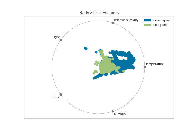
RadViz Visualizer
RadViz is a multivariate data visualization algorithm that plots each
feature dimension uniformly around the circumference of a circle then
plots points on the interior of the circle such that the point
normalizes its values on the axes from the center to each arc. This
mechanism allows as many dimensions as will easily fit on a circle,
greatly expanding the dimensionality of the visualization.
Data scientists use this method to detect separability between classes. E.g. is there an opportunity to learn from the feature set or is there just too much noise?
If your data contains rows with missing values (numpy.nan), those missing
values will not be plotted. In other words, you may not get the entire
picture of your data. RadViz will raise a DataWarning to inform you of the
percent missing.
If you do receive this warning, you may want to look at imputation strategies. A good starting place is the scikit-learn Imputer.
Visualizer |
|
Quick Method |
|
Models |
Classification, Regression |
Workflow |
Feature Engineering |
from yellowbrick.datasets import load_occupancy
from yellowbrick.features import RadViz

# Load the classification dataset
X, y = load_occupancy()

# Specify the target classes
classes = ["unoccupied", "occupied"]

# Instantiate the visualizer
visualizer = RadViz(classes=classes)

visualizer.fit(X, y)           # Fit the data to the visualizer
visualizer.transform(X)        # Transform the data
visualizer.show()              # Finalize and render the figure
(Source code, png, pdf)

For regression, the RadViz visualizer should use a color sequence to
display the target information, as opposed to discrete colors.
Quick Method
The same functionality above can be achieved with the associated quick method radviz. This method will build the RadViz object with the associated arguments, fit it, then (optionally) immediately show the visualization.
from yellowbrick.features.radviz import radviz
from yellowbrick.datasets import load_occupancy

#Load the classification dataset
X, y = load_occupancy()

# Specify the target classes
classes = ["unoccupied", "occupied"]

# Instantiate the visualizer
radviz(X, y, classes=classes)
(Source code, png, pdf)
API Reference
Implements radviz for feature analysis.
- yellowbrick.features.radviz.RadViz
alias of
RadialVisualizer
- class yellowbrick.features.radviz.RadialVisualizer(ax=None, features=None, classes=None, colors=None, colormap=None, alpha=1.0, **kwargs)[source]
Bases:
DataVisualizerRadViz is a multivariate data visualization algorithm that plots each axis uniformely around the circumference of a circle then plots points on the interior of the circle such that the point normalizes its values on the axes from the center to each arc.
- Parameters
- axmatplotlib Axes, default: None
The axis to plot the figure on. If None is passed in the current axes will be used (or generated if required).
- featureslist, default: None
a list of feature names to use The names of the features specified by the columns of the input dataset. This length of this list must match the number of columns in X, otherwise an exception will be raised on
fit().- classeslist, default: None
a list of class names for the legend The class labels for each class in y, ordered by sorted class index. These names act as a label encoder for the legend, identifying integer classes or renaming string labels. If omitted, the class labels will be taken from the unique values in y.
Note that the length of this list must match the number of unique values in y, otherwise an exception is raised. This parameter is only used in the discrete target type case and is ignored otherwise.
- colorslist or tuple, default: None
optional list or tuple of colors to colorize lines A single color to plot all instances as or a list of colors to color each instance according to its class. If not enough colors per class are specified then the colors are treated as a cycle.
- colormapstring or cmap, default: None
optional string or matplotlib cmap to colorize lines The colormap used to create the individual colors. If classes are specified the colormap is used to evenly space colors across each class.
- alphafloat, default: 1.0
Specify a transparency where 1 is completely opaque and 0 is completely transparent. This property makes densely clustered points more visible.
- kwargsdict
Keyword arguments that are passed to the base class and may influence the visualization as defined in other Visualizers.
Examples
>>> visualizer = RadViz()
>>> visualizer.fit(X, y)
>>> visualizer.transform(X)
>>> visualizer.show()
- Attributes
- features_ndarray, shape (n_features,)
The names of the features discovered or used in the visualizer that can be used as an index to access or modify data in X. If a user passes feature names in, those features are used. Otherwise the columns of a DataFrame are used or just simply the indices of the data array.
- classes_ndarray, shape (n_classes,)
The class labels that define the discrete values in the target. Only available if the target type is discrete. This is guaranteed to be strings even if the classes are a different type.
- draw(X, y, **kwargs)[source]
Called from the fit method, this method creates the radviz canvas and draws each instance as a class or target colored point, whose location is determined by the feature data set.
- finalize(**kwargs)[source]
Sets the title and adds a legend. Removes the ticks from the graph to make a cleaner visualization.
- Parameters
- kwargs: generic keyword arguments.
Notes
Generally this method is called from show and not directly by the user.
- fit(X, y=None, **kwargs)[source]
The fit method is the primary drawing input for the visualization since it has both the X and y data required for the viz and the transform method does not.
- Parameters
- Xndarray or DataFrame of shape n x m
A matrix of n instances with m features
- yndarray or Series of length n
An array or series of target or class values
- kwargsdict
Pass generic arguments to the drawing method
- Returns
- selfinstance
Returns the instance of the transformer/visualizer
- yellowbrick.features.radviz.radviz(X, y=None, ax=None, features=None, classes=None, colors=None, colormap=None, alpha=1.0, show=True, **kwargs)[source]
Displays each feature as an axis around a circle surrounding a scatter plot whose points are each individual instance.
This helper function is a quick wrapper to utilize the RadialVisualizer (Transformer) for one-off analysis.
- Parameters
- Xndarray or DataFrame of shape n x m
A matrix of n instances with m features
- yndarray or Series of length n, default:None
An array or series of target or class values
- axmatplotlib Axes, default: None
The axes to plot the figure on.
- featureslist of strings, default: None
The names of the features or columns
- classeslist of strings, default: None
The names of the classes in the target
- colorslist or tuple of colors, default: None
Specify the colors for each individual class
- colormapstring or matplotlib cmap, default: None
Sequential colormap for continuous target
- alphafloat, default: 1.0
Specify a transparency where 1 is completely opaque and 0 is completely transparent. This property makes densely clustered points more visible.
- show: bool, default: True
If True, calls
show(), which in turn callsplt.show()however you cannot callplt.savefigfrom this signature, norclear_figure. If False, simply callsfinalize()- kwargsdict
Keyword arguments passed to the visualizer base classes.
- Returns
- vizRadViz
Returns the fitted, finalized visualizer