PCA Projection
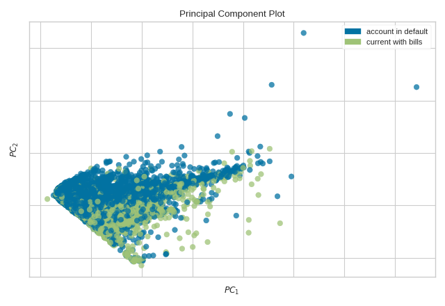
The PCA Decomposition visualizer utilizes principal component analysis to decompose high dimensional data into two or three dimensions so that each instance can be plotted in a scatter plot. The use of PCA means that the projected dataset can be analyzed along axes of principal variation and can be interpreted to determine if spherical distance metrics can be utilized.
Visualizer |
|
Quick Method |
|
Models |
Classification/Regression |
Workflow |
Feature Engineering/Selection |
from yellowbrick.datasets import load_credit
from yellowbrick.features import PCA

# Specify the features of interest and the target
X, y = load_credit()
classes = ['account in default', 'current with bills']

visualizer = PCA(scale=True, classes=classes)
visualizer.fit_transform(X, y)
visualizer.show()
(Source code, png, pdf)

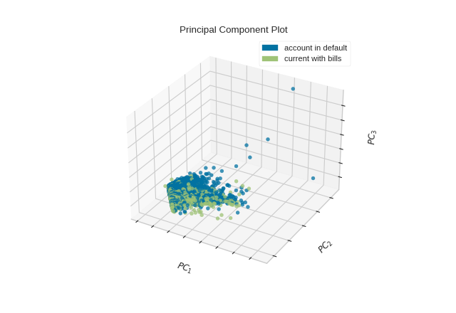
The PCA projection can also be plotted in three dimensions to attempt to visualize more principal components and get a better sense of the distribution in high dimensions.
from yellowbrick.datasets import load_credit
from yellowbrick.features import PCA

X, y = load_credit()
classes = ['account in default', 'current with bills']

visualizer = PCA(
    scale=True, projection=3, classes=classes
)
visualizer.fit_transform(X, y)
visualizer.show()
(Source code, png, pdf)
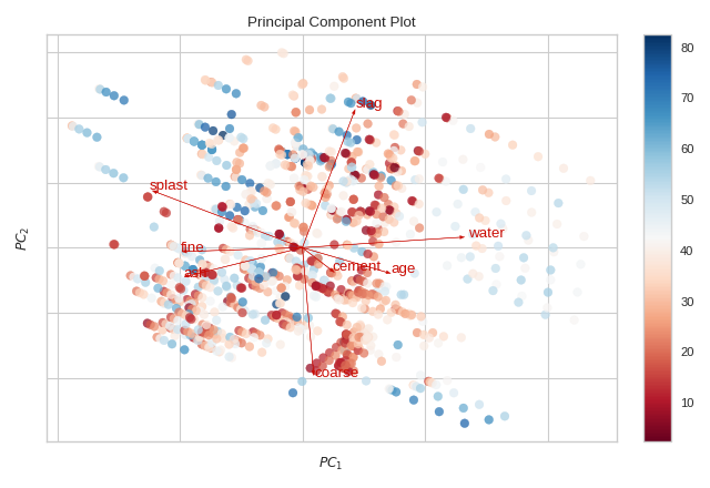
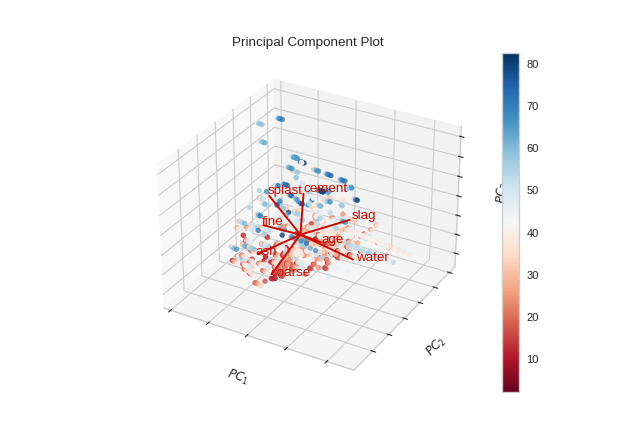
Biplot
The PCA projection can be enhanced to a biplot whose points are the projected instances and whose vectors represent the structure of the data in high dimensional space. By using proj_features=True, vectors for each feature in the dataset are drawn on the scatter plot in the direction of the maximum variance for that feature. These structures can be used to analyze the importance of a feature to the decomposition or to find features of related variance for further analysis.
from yellowbrick.datasets import load_concrete
from yellowbrick.features import PCA

# Load the concrete dataset
X, y = load_concrete()

visualizer = PCA(scale=True, proj_features=True)
visualizer.fit_transform(X, y)
visualizer.show()
(Source code, png, pdf)

from yellowbrick.datasets import load_concrete
from yellowbrick.features import PCA

X, y = load_concrete()

visualizer = PCA(scale=True, proj_features=True, projection=3)
visualizer.fit_transform(X, y)
visualizer.show()
(Source code, png, pdf)

Quick Method
The same functionality above can be achieved with the associated quick method pca_decomposition. This method
will build the PCA object with the associated arguments, fit it, then (optionally) immediately
show it.
from yellowbrick.datasets import load_credit
from yellowbrick.features import pca_decomposition

# Specify the features of interest and the target
X, y = load_credit()
classes = ['account in default', 'current with bills']

# Create, fit, and show the visualizer
pca_decomposition(
    X, y, scale=True, classes=classes
)
(Source code, png, pdf)

API Reference
Decomposition based feature visualization with PCA.
- class yellowbrick.features.pca.PCA(ax=None, features=None, classes=None, scale=True, projection=2, proj_features=False, colors=None, colormap=None, alpha=0.75, random_state=None, colorbar=True, heatmap=False, **kwargs)[source]
Bases:
ProjectionVisualizerProduce a two or three dimensional principal component plot of a data array projected onto its largest sequential principal components. It is common practice to scale the data array
Xbefore applying a PC decomposition. Variable scaling can be controlled using thescaleargument.- Parameters
- axmatplotlib Axes, default: None
The axes to plot the figure on. If None is passed in, the current axes will be used (or generated if required).
- featureslist, default: None
The names of the features specified by the columns of the input dataset. This length of this list must match the number of columns in X, otherwise an exception will be raised on
fit().- classeslist, default: None
The class labels for each class in y, ordered by sorted class index. These names act as a label encoder for the legend, identifying integer classes or renaming string labels. If omitted, the class labels will be taken from the unique values in y.
Note that the length of this list must match the number of unique values in y, otherwise an exception is raised. This parameter is only used in the discrete target type case and is ignored otherwise.
- scalebool, default: True
Boolean that indicates if user wants to scale data.
- projectionint or string, default: 2
The number of axes to project into, either 2d or 3d. To plot 3d plots with matplotlib, please ensure a 3d axes is passed to the visualizer, otherwise one will be created using the current figure.
- proj_featuresbool, default: False
Boolean that indicates if the user wants to project the features in the projected space. If True the plot will be similar to a biplot.
- colorslist or tuple, default: None
A single color to plot all instances as or a list of colors to color each instance according to its class in the discrete case or as an ordered colormap in the sequential case. If not enough colors per class are specified then the colors are treated as a cycle.
- colormapstring or cmap, default: None
The colormap used to create the individual colors. In the discrete case it is used to compute the number of colors needed for each class and in the continuous case it is used to create a sequential color map based on the range of the target.
- alphafloat, default: 0.75
Specify a transparency where 1 is completely opaque and 0 is completely transparent. This property makes densely clustered points more visible.
- random_stateint, RandomState instance or None, optional (default None)
This parameter sets the random state on this solver. If the input X is larger than 500x500 and the number of components to extract is lower than 80% of the smallest dimension of the data, then the more efficient randomized solver is enabled.
- colorbarbool, default: True
If the target_type is “continous” draw a colorbar to the right of the scatter plot. The colobar axes is accessible using the cax property.
- heatmapbool, default: False
Add a heatmap showing contribution of each feature in the principal components. Also draws a colorbar for readability purpose. The heatmap is accessible using lax property and colorbar using uax property.
- kwargsdict
Keyword arguments that are passed to the base class and may influence the visualization as defined in other Visualizers.
Examples
>>> from sklearn import datasets
>>> iris = datasets.load_iris()
>>> X = iris.data
>>> y = iris.target
>>> visualizer = PCA()
>>> visualizer.fit_transform(X, y)
>>> visualizer.show()
- Attributes
- pca_components_ndarray, shape (n_features, n_components)
This tells about the magnitude of each feature in the pricipal components. This is primarily used to draw the biplots.
- classes_ndarray, shape (n_classes,)
The class labels that define the discrete values in the target. Only available if the target type is discrete. This is guaranteed to be strings even if the classes are a different type.
- features_ndarray, shape (n_features,)
The names of the features discovered or used in the visualizer that can be used as an index to access or modify data in X. If a user passes feature names in, those features are used. Otherwise the columns of a DataFrame are used or just simply the indices of the data array.
- range_(min y, max y)
A tuple that describes the minimum and maximum values in the target. Only available if the target type is continuous.
- draw(Xp, y)[source]
Plots a scatterplot of points that represented the decomposition, pca_features_, of the original features, X, projected into either 2 or 3 dimensions.
If 2 dimensions are selected, a colorbar and heatmap can also be optionally included to show the magnitude of each feature value to the component.
- Parameters
- Xparray-like of shape (n, 2) or (n, 3)
The matrix produced by the
transform()method.- yarray-like of shape (n,), optional
The target, used to specify the colors of the points.
- Returns
- self.axmatplotlib Axes object
Returns the axes that the scatter plot was drawn on.
- finalize(**kwargs)[source]
Draws the title, labels, legends, heatmap, and colorbar as specified by the keyword arguments.
- fit(X, y=None, **kwargs)[source]
Fits the PCA transformer, transforms the data in X, then draws the decomposition in either 2D or 3D space as a scatter plot.
- Parameters
- Xndarray or DataFrame of shape n x m
A matrix of n instances with m features.
- yndarray or Series of length n
An array or series of target or class values.
- Returns
- selfvisualizer
Returns self for use in Pipelines.
- property lax
The axes of the heatmap below scatter plot.
- layout(divider=None)[source]
Creates the layout for colorbar and heatmap, adding new axes for the heatmap if necessary and modifying the aspect ratio. Does not modify the axes or the layout if
self.heatmapisFalseorNone.- Parameters
- divider: AxesDivider
An AxesDivider to be passed among all layout calls.
- property random_state
- transform(X, y=None, **kwargs)[source]
Calls the internal transform method of the scikit-learn PCA transformer, which performs a dimensionality reduction on the input features
X. Next calls thedrawmethod of the Yellowbrick visualizer, finally returning a new array of transformed features of shape(len(X), projection).- Parameters
- Xndarray or DataFrame of shape n x m
A matrix of n instances with m features.
- yndarray or Series of length n
An array or series of target or class values.
- Returns
- Xpndarray or DataFrame of shape n x m
Returns a new array-like object of transformed features of shape
(len(X), projection).
- property uax
The axes of the colorbar, bottom of scatter plot. This is the colorbar for heatmap and not for the scatter plot.
- yellowbrick.features.pca.pca_decomposition(X, y=None, ax=None, features=None, classes=None, scale=True, projection=2, proj_features=False, colors=None, colormap=None, alpha=0.75, random_state=None, colorbar=True, heatmap=False, show=True, **kwargs)[source]
Produce a two or three dimensional principal component plot of the data array
Xprojected onto its largest sequential principal components. It is common practice to scale the data arrayXbefore applying a PC decomposition. Variable scaling can be controlled using thescaleargument.- Parameters
- Xndarray or DataFrame of shape n x m
A matrix of n instances with m features.
- yndarray or Series of length n
An array or series of target or class values.
- axmatplotlib Axes, default: None
The axes to plot the figure on. If None is passed in, the current axes will be used (or generated if required).
- featureslist, default: None
The names of the features specified by the columns of the input dataset. This length of this list must match the number of columns in X, otherwise an exception will be raised on
fit().- classeslist, default: None
The class labels for each class in y, ordered by sorted class index. These names act as a label encoder for the legend, identifying integer classes or renaming string labels. If omitted, the class labels will be taken from the unique values in y.
Note that the length of this list must match the number of unique values in y, otherwise an exception is raised. This parameter is only used in the discrete target type case and is ignored otherwise.
- scalebool, default: True
Boolean that indicates if user wants to scale data.
- projectionint or string, default: 2
The number of axes to project into, either 2d or 3d. To plot 3d plots with matplotlib, please ensure a 3d axes is passed to the visualizer, otherwise one will be created using the current figure.
- proj_featuresbool, default: False
Boolean that indicates if the user wants to project the features in the projected space. If True the plot will be similar to a biplot.
- colorslist or tuple, default: None
A single color to plot all instances as or a list of colors to color each instance according to its class in the discrete case or as an ordered colormap in the sequential case. If not enough colors per class are specified then the colors are treated as a cycle.
- colormapstring or cmap, default: None
The colormap used to create the individual colors. In the discrete case it is used to compute the number of colors needed for each class and in the continuous case it is used to create a sequential color map based on the range of the target.
- alphafloat, default: 0.75
Specify a transparency where 1 is completely opaque and 0 is completely transparent. This property makes densely clustered points more visible.
- random_stateint, RandomState instance or None, optional (default None)
This parameter sets the random state on this solver. If the input X is larger than 500x500 and the number of components to extract is lower than 80% of the smallest dimension of the data, then the more efficient randomized solver is enabled.
- colorbarbool, default: True
If the target_type is “continous” draw a colorbar to the right of the scatter plot. The colobar axes is accessible using the cax property.
- heatmapbool, default: False
Add a heatmap showing contribution of each feature in the principal components. Also draws a colorbar for readability purpose. The heatmap is accessible using lax property and colorbar using uax property.
- showbool, default: True
If True, calls
show(), which in turn callsplt.show()however you cannot callplt.savefigfrom this signature, norclear_figure. If False, simply callsfinalize()- kwargsdict
Keyword arguments that are passed to the base class and may influence the visualization as defined in other Visualizers.
Examples
>>> from sklearn import datasets
>>> iris = datasets.load_iris()
>>> X = iris.data
>>> y = iris.target
>>> pca_decomposition(X, y, colors=['r', 'g', 'b'], projection=3)
- Attributes
- pca_components_ndarray, shape (n_features, n_components)
This tells about the magnitude of each feature in the pricipal components. This is primarily used to draw the biplots.
- classes_ndarray, shape (n_classes,)
The class labels that define the discrete values in the target. Only available if the target type is discrete. This is guaranteed to be strings even if the classes are a different type.
- features_ndarray, shape (n_features,)
The names of the features discovered or used in the visualizer that can be used as an index to access or modify data in X. If a user passes feature names in, those features are used. Otherwise the columns of a DataFrame are used or just simply the indices of the data array.
- range_(min y, max y)
A tuple that describes the minimum and maximum values in the target. Only available if the target type is continuous.